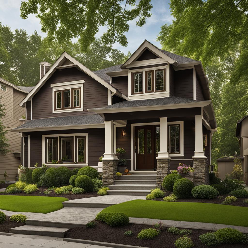
I’m excited to share with you the best trim color options for a dark brown house. Choosing the right trim color can transform the overall look and feel of your home, enhancing its curb appeal and adding a touch of elegance. In this article, I will explore some popular choices and provide recommendations to help you make an informed decision.
Key Takeaways:
- Off-white and cream are timeless trim colors that complement dark brown houses.
- Light gray, white, and light brown are also popular choices for trim color.
- Consider the cost of exterior painting and the type of finish when selecting a trim color.
- White is the most preferred color for window trim, followed by gray, beige/clay, and light wood.
- Lighter trim colors have heat reflective properties and are more fade-resistant than darker colors.
The Importance of Exterior Color Trends
As homeowners, we are always looking for ways to improve and refresh the exterior of our homes. One of the most effective ways to achieve this is by staying up-to-date with the latest exterior color trends. The right trim color can enhance the overall aesthetics of a dark brown house and add curb appeal, making it a worthwhile investment for any home improvement project.
Exterior color trends play a significant role in the world of design and home improvement. They are influenced by a variety of factors, including architecture, fashion, and consumer preferences. By keeping an eye on these trends, homeowners can update the look of their homes and ensure that they stay current with the latest styles.
Refresh the exterior of their homes with colors that stand the test of time. Whether it’s a classic off-white, a trendy light gray, or a timeless cream, the right trim color can transform the look of a dark brown house and create a welcoming and visually appealing exterior.
The Significance of Exterior Color Trends
“Exterior color trends reflect the evolving tastes and preferences of homeowners. They provide inspiration and guidance for those looking to refresh their homes and create a more modern and appealing exterior.”
Following exterior color trends is not just about keeping up with the latest fads; it’s about creating a home that reflects your personal style and taste. By incorporating popular trim colors into your home’s exterior, you can ensure that it stands out and makes a statement in your neighborhood.
So, whether you’re planning to repaint your trim or simply looking for ways to freshen up your home’s exterior, exploring exterior color trends is a great place to start. By staying informed and embracing new ideas, you can create a home that is both stylish and timeless.
Cost Considerations for Exterior Painting
When it comes to painting the exterior of a house, cost is an important consideration. The price of an exterior painting project can vary depending on various factors, including the size of the house, the number of stories, and the amount of detail work required. The cost is typically calculated per square foot, ranging from $1.50 to $4.50. It is crucial to understand these pricing factors to plan and budget for the project accordingly.
Affordability can also be influenced by the type of finish being painted. Concrete and wood finishes are generally more affordable, while stucco and brick tend to be more expensive due to their texture and additional preparation requirements. It is essential to consult with professional painters to get accurate quotes and understand the specific pricing factors for your house.
Factors Affecting the Cost of Exterior Painting:
- Size of the house
- Number of stories
- Amount of detail work
- Type of finish (concrete, wood, stucco, brick, etc.)
- Condition of the existing paint
- Accessibility of the surfaces
- Geographical location

Getting multiple quotes from reputable painters can help you compare prices and choose the best option for your budget. Keep in mind that while affordability is important, quality should not be compromised. It is worth investing in a professional painter who can ensure a long-lasting and high-quality paint job.
By considering the cost considerations for exterior painting and exploring different affordable finishes to paint, you can make informed decisions about your painting project. Remember to factor in any additional costs such as paint supplies, labor, and potential repairs or surface preparation. With careful planning and budgeting, you can transform the appearance of your dark brown house while staying within your desired price range.
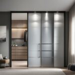
Window Trim Color Trends
When it comes to window trim colors, white continues to be the favorite choice among homeowners. Despite the rising popularity of dark-framed windows, especially for farmhouse-style homes, white trim remains a classic and timeless option. Its clean and crisp appearance complements various architectural styles and can enhance the overall aesthetics of a dark brown house.
In addition to white, there are several other preferred window trim colors that homeowners consider. Gray, beige/clay, light wood, dark wood, and black are all popular choices. The selection of a window trim color often depends on factors such as cost, availability, and influence from home improvement shows.
Table: Popular Window Trim Colors
| Color | Description |
|---|---|
| White | A classic and timeless choice |
| Gray | A versatile and neutral option |
| Beige/Clay | Warm and earthy tones |
| Light Wood | Natural and rustic look |
| Dark Wood | Sophisticated and elegant |
| Black | Creates a bold and dramatic contrast |
Choosing the right window trim color is an essential aspect of enhancing the visual appeal and curb appeal of a dark brown house. It is important to consider the overall design aesthetic, architectural style, and personal preferences when making this decision. Whether sticking to the classic white or exploring other popular options, the window trim color can truly transform the look and feel of a home.
The Heat Reflective and Fade-resistant Properties of Lighter Colors
When it comes to selecting the best trim color for a dark brown house, considering the heat reflective and fade-resistant properties of lighter colors can make a significant difference. Lighter trim colors, such as off-white and cream, offer practical benefits in addition to enhancing the appearance of the house.
Lighter colors have the advantage of reflecting heat, which can help reduce cooling costs during hot weather. By reflecting the sun’s rays, these colors prevent excessive heat absorption, keeping the house cooler and more comfortable. This can be particularly beneficial in regions with hot climates, where energy efficiency is a priority.
In addition to their heat reflective properties, lighter colors also tend to be more fade-resistant than darker colors. Over time, prolonged exposure to sunlight can cause darker colors to fade and lose their vibrancy. Lighter trim colors, on the other hand, are less prone to fading, ensuring that the house maintains its fresh and bright appearance for years to come.

Benefits of Lighter Colors for Trim
The use of lighter trim colors also allows for greater versatility in exterior design. Lighter shades create a contrast against the dark brown house, highlighting architectural details and adding visual interest. They can complement a variety of color palettes and architectural styles, making them a versatile choice for any homeowner.
Furthermore, lighter trim colors have a timeless appeal that can withstand changing trends. While darker trim colors may go in and out of fashion, lighter hues like off-white and cream remain classic and sophisticated choices that can enhance the overall aesthetics of a dark brown house for years to come.
| Benefits of Lighter Trim Colors | Keywords |
|---|---|
| Heat reflective properties | heat reflective colors |
| Fade-resistant | fade-resistant colors |
| Versatility in design | lighter trim colors |
| Timeless appeal | lighter hues, classic choices |
Freshening Up Gray Color Schemes: Alternatives to Mid-tone Gray as a Trim Color
Mid-tone gray has been a popular choice as a trim color for dark brown houses for quite some time. However, trends in home design are shifting, and homeowners are looking for new ways to freshen up their gray color schemes. While mid-tone gray is going out of style, there are plenty of alternatives to consider that can bring a modern and updated look to your home.
Creating Contrast with Warmer Earth Tones
One alternative to mid-tone gray as a trim color is to incorporate warmer earth tones. Shades of camel, brown, and taupe can add depth and richness to your exterior. These warm hues create a cozy and inviting atmosphere, making them a great choice for adding a touch of modernity to your home’s appearance. Pairing these earth tones with a dark brown house can create a sophisticated and elegant combination.
Adding Fresh Colors for a Pop of Vibrancy
If you’re looking to add more personality and vibrancy to your gray color scheme, consider incorporating fresh colors into your exterior design. Shades of green or coral can bring a lively and energetic feel to your home’s exterior. Whether through accent chairs, pillows, or artwork, these pops of color can create a visually appealing contrast against the dark brown house. It’s all about finding the right balance between the neutral gray tones and the lively accents.
By exploring these alternatives to mid-tone gray, you can give your dark brown house a fresh and updated look. Whether you opt for warmer earth tones or vibrant pops of color, the key is to create a contrast that highlights the beauty of your home’s exterior. Remember to consider your personal style and preferences when making these choices to ensure a home that truly reflects your unique vision.

| Trim Color | Key Features |
|---|---|
| Warm Earth Tones | Brings depth and richness |
| Fresh Colors | Brings vibrancy and energy |
Alternatives to Off-White Walls
While off-white has been extensively used as a wall color, it is now being overused as a neutral. Instead of painting everything off-white, there are alternative ways to incorporate this versatile color into your home. Consider using off-white as a trim or cabinet color to create contrast with friendlier wall colors. This approach can give your walls a more current look without resorting to the overused off-white hue.
When it comes to choosing alternative wall colors, there are numerous fresh and subtle options available. Soft greiges, warm beiges, and gentle blush pinks are just a few examples. These colors can add depth and character to your space while maintaining a neutral and inviting atmosphere. It’s important to explore different shades and undertones to find the perfect alternative to off-white that suits your personal style and complements your dark brown house.

Incorporating Color with Accent Walls
If you’re looking to introduce more color into your space, consider creating an accent wall. This involves painting one wall in a bold or vibrant color while keeping the remaining walls in a more neutral shade. Accent walls can add visual interest and bring life to a room without overwhelming the space. They provide an opportunity to showcase your personal style and experiment with different color palettes, all while maintaining a cohesive look.
| Accent Wall Color Ideas | Complementary Neutral Shades |
|---|---|
| Teal | Light gray |
| Deep navy | Beige |
| Bold yellow | Cream |
| Rich emerald green | Greige |
By incorporating an accent wall, you can infuse your dark brown house with color and personality while still maintaining a sense of balance and harmony.
The Drawbacks of True White Walls
When considering the best trim color for a dark brown house, true white walls may seem like a popular and safe choice. However, there are certain drawbacks to using true white as a wall color. One of the main issues is that true white can make furniture look dingy and less vibrant. It lacks the warmth and depth that other pale neutral colors can provide.
In order to choose the right pale neutral wall color, it is important to take stock of the neutral undertones in the hard finishes and furnishings of a room. This means considering the existing colors of the floors, countertops, and other fixed elements. By doing so, you can select a pale neutral color that harmonizes and complements the overall color scheme of the space.
Choosing the right neutral undertones is crucial for creating a cohesive and pleasing aesthetic. For example, if the room has warm wood tones, selecting a pale neutral with warm undertones can create a harmonious and inviting atmosphere. On the other hand, if the room has cooler elements such as stainless steel appliances, choosing a pale neutral with cool undertones can create a more contemporary and sleek look.
By avoiding true white walls and instead choosing pale neutral colors with the right undertones, you can enhance the overall design of your space. These colors can create a more inviting and harmonious atmosphere while allowing your furniture and decor to shine. So, before painting your walls, take the time to consider the neutral undertones in your space to ensure a more cohesive and pleasing aesthetic.
| Drawbacks of True White Walls | Advantages of Pale Neutral Wall Colors |
|---|---|
| Can make furniture look dingy and less vibrant | Enhance the overall design of the space |
| Lacks warmth and depth | Create a more inviting atmosphere |
| May not harmonize with existing colors | Allow furniture and decor to shine |
| Can be selected based on the neutral undertones in the space |
The Shift Away from Black Paint
When it comes to choosing trim colors for a dark brown house, there is a notable shift away from black paint. Homeowners are now opting for softer mid-toned colors that create a current take on bold. This shift is driven by the desire to infuse warmth and a more inviting atmosphere into the exterior of homes.
Using softer mid-toned colors allows for a subtler contrast with the dark brown house, creating a more harmonious and balanced look. These colors, such as warm grays, soft browns, and muted blues, offer a contemporary aesthetic while still providing enough visual interest to enhance the overall appearance of the house.
“I wanted to move away from the starkness of black trim and explore more nuanced options. By choosing a soft gray color for the trim, I was able to create a sophisticated and modern look that complements the dark brown house beautifully.” – Homeowner
Creating a current take on bold doesn’t necessarily mean completely abandoning darker colors. Deep, rich hues like navy blue and forest green can still be incorporated into the exterior design as accent colors, adding depth and character to the overall color scheme.
| Old Trend | New Trend |
|---|---|
| Black trim | Soft mid-toned colors |
| High-contrast look | Harmonious and balanced look |
| Minimal warmth | Infused warmth |
By embracing the shift away from black paint and using softer mid-toned colors, homeowners can create a visually appealing exterior that reflects current design trends while still maintaining a timeless and elegant aesthetic.
Introduction to Paint Color of the Year (COTY)
Every year, paint manufacturers and industry experts select a Paint Color of the Year. This annual tradition has become a way to showcase trending colors and offer inspiration for homeowners looking to update their living spaces. The Paint Color of the Year is not only a reflection of current design trends but also a predictor for future color choices in home furnishings and cabinetry.
Paint Color of the Year selections are based on a combination of manufacturer predictions and consumer preferences. These selections aim to capture the essence of current trends in consumer habits and provide insight into the colors that will dominate the interior design landscape. They serve as a guiding light for homeowners, designers, and decorators, offering a glimpse into the future of color choices for their spaces.
The Paint Color of the Year is more than just a hue; it represents the collective preferences and desires of homeowners and industry professionals. With its influence on home furnishings, textiles, and cabinetry colors, the Paint Color of the Year plays a crucial role in shaping the aesthetic direction of interior design.
Trends in Consumer Habits
“The Paint Color of the Year is a reflection of the current zeitgeist. It captures the overarching trends and preferences that homeowners have when it comes to color choices. By analyzing consumer habits, paint manufacturers can identify the colors that resonate most with homeowners and create color palettes that align with their needs and desires.” – Industry Expert
As consumer habits continue to evolve, so do the preferences for paint colors. The Paint Color of the Year serves as a barometer of these evolving tastes, helping homeowners stay up-to-date with the latest trends in color and design. It is a valuable tool for those seeking to create a fresh and modern look in their living spaces.
Predictor for Home Furnishings and Cabinetry Colors
The selection of the Paint Color of the Year goes beyond just paint. It has a ripple effect on the entire home decor industry. Manufacturers of home furnishings and cabinetry take cues from the chosen color, incorporating it into their designs and product offerings. This creates a harmonious and cohesive look between the paint on the walls and the furniture and cabinetry throughout the space.
By following the Paint Color of the Year, homeowners can ensure their interior design choices align with current trends, creating a stylish and fashionable home. Whether it’s through accent pieces, upholstery, or even kitchen cabinets, the Paint Color of the Year sets the tone for the entire home decor industry.
Behr Color of the Year 2024: Cracked Pepper
Behr has recently announced Cracked Pepper as its Color of the Year for 2024. This dark neutral color is a versatile choice for trim color, offering a timeless and elegant aesthetic. With hints of brown undertones, Cracked Pepper adds depth and sophistication to any space.
The versatility of Cracked Pepper allows it to be paired with a variety of other colors, making it a popular choice for both interior and exterior design. In terms of interior design, this color can be used to create a moody and dramatic room by combining it with deep jewel tones or rich earthy hues. For a more contemporary look, it can be paired with lighter shades and metallic accents to add contrast and visual interest.
When it comes to exterior design, Cracked Pepper can elevate the elegance of furniture and fixtures such as doors, windows, and trim. Its dark, neutral tone creates a striking contrast against lighter or brighter house colors, adding depth and character to the overall appearance. Whether used as the main color or as an accent, Cracked Pepper is a versatile choice that complements various architectural styles and design preferences.
| Key Features of Behr Color of the Year 2024: Cracked Pepper |
|---|
| Versatile dark neutral color |
| Adds depth and sophistication |
| Pairs well with a variety of colors |
| Can create a moody or dramatic room |
| Elevates the elegance of furniture and fixtures |
Overall, Behr’s Color of the Year 2024, Cracked Pepper, offers homeowners a classic and timeless choice for trim color. Its dark, neutral tone provides versatility and sophistication, allowing it to be paired with various colors and design styles. Whether used for interior or exterior design, Cracked Pepper adds depth and character to any space, making it a popular and stylish choice.
Sherwin Williams HGTV Home Color of the Year 2024: Persimmon
It’s always exciting to see what colors will take center stage in the world of design and home decor each year. Sherwin Williams, in collaboration with HGTV Home, has officially announced their Color of the Year 2024: Persimmon. This bold and vibrant shade of orange is sure to make a statement in any space.
Persimmon is a versatile color that can be used in a variety of ways. Whether you’re looking to create a warm and inviting living room or add a pop of color to your kitchen, this hue is perfect for making a bold design statement. Pair it with warm creams, wood tones, and patterned fabrics for a cohesive and visually appealing look.
While Persimmon may not be everyone’s cup of tea, it’s important to remember that personal preference plays a significant role in choosing the right color for your home. Some may find this shade of orange uninspiring on its own and prefer paler or deeper versions of the color. In the end, it’s all about creating a space that reflects your unique style and taste.
Whether you choose to incorporate Persimmon into your home or explore other color options, the key is to have fun and experiment. Paint colors can always be changed, so don’t be afraid to take risks and embrace your creativity. After all, your home should be a reflection of who you are and what you love.
My Favorite Persimmon-inspired Design Ideas
- Create a cozy reading nook with a Persimmon-colored armchair and a rustic wooden bookshelf.
- Add a touch of Persimmon to your bedroom with vibrant orange throw pillows and a matching bedspread.
- Give your kitchen a bold makeover by painting your cabinets in Persimmon and pairing them with sleek stainless steel appliances.
“Persimmon is a color that evokes warmth and energy. It’s perfect for those who want to make a statement and add a touch of vibrancy to their living spaces.” – Interior Designer
Table: Comparing Persimmon with Other Sherwin Williams Color Selections
| Color | Description | Best Use |
|---|---|---|
| Persimmon | A bold and vibrant shade of orange with warm undertones. | Creating a focal point in a room or adding a pop of color to a neutral palette. |
| Cracked Pepper | A soft charcoal black with hints of brown undertones. | Adding drama and contrast to a space or elevating the elegance of furniture. |
| Other Sherwin Williams Colors | A wide range of color options to suit different design styles and preferences. | Creating a personalized color palette that reflects your individual taste. |
The Significance of Personal Preference
When it comes to choosing the best trim color for a dark brown house, personal preference plays a significant role. While trends and expert opinions can provide valuable guidance, it’s important to select colors that resonate with your individual style and taste. Your home should be a reflection of your personality and design sensibilities, and the trim color is an opportunity to express your unique vision.
Using colors regardless of trends can result in a more authentic and personalized space. Don’t be afraid to follow your instincts and choose a trim color that speaks to you. Whether you prefer bold and vibrant hues, or subtle and understated shades, there are no rules in design when it comes to personal preference.
It’s also worth considering that personal color preferences can evolve over time. As your style and taste change, you may find yourself drawn to different color palettes. Embrace this evolution and don’t be afraid to experiment with new trim colors that align with your current vision for your home.
Ultimately, the importance of individual vision cannot be overstated. Your home is a reflection of who you are, and your trim color plays a vital role in creating the desired ambiance and aesthetic. So, trust your instincts, explore different options, and choose a trim color that brings you joy and makes your dark brown house truly feel like home.
| Personal Preference | Advantages |
|---|---|
| Authenticity | Allows for a truly personalized space |
| Flexibility | Can evolve with changing tastes and styles |
| Emotional Connection | Brings joy and creates a sense of home |
Conclusion
After exploring the best trim color options for a dark brown house, it is clear that off-white and cream are timeless choices that provide elegance, versatility, and modern appeal. These colors complement various architectural styles and are preferred by many homeowners. Additionally, light gray, white, and light brown are popular alternatives for trim colors.
It is important to consider cost considerations when undertaking an exterior painting project. Factors such as the size of the house, number of stories, and type of finish can significantly impact the overall cost. Concrete and wood finishes tend to be more affordable, while stucco and brick can be pricier to paint.
Window trim color trends showcase a preference for white, despite the rising popularity of dark-framed windows. Factors such as cost, availability, and influence from home improvement shows often play a role in the choice of window trim color.
Lastly, personal preference should guide the decision-making process when choosing the best trim color. Trends can provide inspiration, but it is essential to select colors that resonate with individual style and taste. Ultimately, creating a home that reflects one’s personality and design sensibilities is of utmost importance.
FAQ
What are the best trim colors for a dark brown house?
According to a report commissioned by vinyl siding manufacturer Alside, off-white and cream are often chosen as the best trim colors for a dark brown house. Other popular options include light gray, white, and light brown.
How much does it cost to paint the exterior of a house?
The cost of painting the exterior of a house typically ranges from $1.50 to $4.50 per square foot. Factors such as the size of the house, number of stories, and amount of detail work can influence the cost.
What are the popular window trim colors?
White is the most popular choice for window trim, followed by gray, beige/clay, light wood, dark wood, and black. These colors are influenced by factors such as cost, availability, and trends in home improvement.
What are the benefits of using lighter trim colors for a dark brown house?
Lighter trim colors, such as off-white and cream, have heat reflective properties that can help reduce cooling costs during hot weather. Additionally, lighter colors are more fade-resistant than darker ones.
Is mid-tone gray still a popular trim color?
Mid-tone gray has been popular in the past, but it is now going out of style. Homeowners are opting for warmer pale wall colors or incorporating fresh colors like green or coral through accents and decor.
Is off-white still a popular wall color?
Off-white has been extensively used as a wall color, but it is now being overused as a neutral. To create contrast and a more current look, it is recommended to use off-white as a trim or cabinet color instead.
Are true white walls still a good choice?
True white walls, such as BM Chantilly Lace or SW High Reflective White, can make furniture look dingy. It is recommended to choose a pale neutral wall color that complements the neutral undertones in the hard finishes and furnishings of a room.
Is black still a popular accent color?
While black has been a prominent accent color, there is now a shift towards using softer mid-toned to light colors for a more current look. Warm, earthy tones and vibrant combinations are becoming popular choices.
What is the Paint Color of the Year for 2024?
Behr has chosen Cracked Pepper as its Color of the Year for 2024. This soft charcoal black with brown undertones is a versatile color that can be used for trim to add drama or elevate furniture.
What is the Color of the Year for 2024 by Sherwin Williams HGTV Home?
Sherwin Williams HGTV Home has selected Persimmon as its Color of the Year for 2024. This shade of orange can be successful as a wall color when paired with warm creams, wood tones, and patterned fabrics.
How important is personal preference in choosing a trim color?
Personal preference plays a significant role in choosing the best trim color for a dark brown house. Trends can provide inspiration, but it is essential to select colors that resonate with individual style and taste.