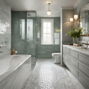


In 2024, there are several top picks for the best paint colors that look good with wood trim. These colors can bring timeless warmth and character to your space, creating a cohesive look that enhances the beauty of your wood trim. Whether you’re looking to spruce up your living room, kitchen, bedroom, or any other area, these paint colors will help you achieve the desired aesthetic.
When choosing the perfect paint color, it’s important to consider the overall ambiance you want to create. From vibrant blues to rich browns, there is a range of options to suit every style and preference. Whether you prefer a cozy and inviting atmosphere or a sleek and refined look, you’ll find inspiration in these top picks for paint colors with wood trim.
Key Takeaways:
- There are several top picks for the best paint colors that look good with wood trim.
- These colors can bring warmth and character to your space, enhancing the beauty of your wood trim.
- Consider the overall ambiance you want to create when choosing a paint color.
- From vibrant blues to rich browns, there is a range of options to suit different styles and preferences.
- Experiment with different shades and combinations to find the perfect paint color for your home.
Chinese Blue by Farrow & Ball
When it comes to finding the perfect paint color to complement wood trim, Chinese Blue by Farrow & Ball is a standout choice. This bold and joyful shade of blue brings a touch of exuberance to any space, whether it’s a light-filled kitchen or a cozy living room. Chinese Blue works well in both traditional and contemporary settings, adding a vibrant pop of color that pairs beautifully with neutral hues or contrasting shades like hot pink.
To create a cohesive look in your home, consider incorporating Chinese Blue into your design scheme. Its versatile nature allows it to work harmoniously with a variety of wood trim styles. This paint color is particularly well-suited for spaces that receive plenty of natural light, as it adds a fresh and uplifting vibe to the room.
“Chinese Blue by Farrow & Ball delivers a punch of joyful exuberance and can be used in both traditional and contemporary spaces.”
Whether you’re aiming for a modern, eclectic look or a more traditional aesthetic, Chinese Blue by Farrow & Ball is a paint color that will make a statement. Its vibrant energy and versatility make it an excellent choice for those looking to add personality and character to their space.
Chinese Blue: Paint Colors for light-filled kitchen or living room
| Pros of Chinese Blue | Cons of Chinese Blue |
|---|---|
| Brings joy and exuberance to a space | May not be suitable for smaller or poorly lit rooms |
| Works well with wood trim | Requires careful consideration when pairing with other colors |
| Can be used in both traditional and contemporary spaces | May not be suitable for those who prefer more muted or subtle colors |
London Clay by Farrow & Ball
London Clay by Farrow & Ball is a warm and rich brown paint color that is perfect for wood trim. This paint color adds a touch of elegance and sophistication to any space, making it ideal for poorly lit areas such as narrow hallways. London Clay can be paired with a variety of colors, including pinks, greens, blues, and earthy neutrals, allowing you to create a unique and inviting atmosphere. Its versatility makes it a great choice for those looking to enhance the warmth and character of their wood trim.
When using London Clay in poorly lit spaces, it’s important to consider the overall lighting design. Adding strategically placed lighting fixtures, such as wall sconces or table lamps, can help illuminate the space and enhance the richness of the color. Additionally, incorporating mirrors or light-colored furniture can help reflect and distribute light, making the room feel brighter and more inviting.
Considerations for Using London Clay:
- Create contrast: Pair London Clay with lighter shades or pops of color to create visual interest and balance in the space.
- Choose the right finish: Depending on the desired look and feel, opt for a matte or eggshell finish for a more subtle and sophisticated appearance, or a satin finish for a slightly reflective and durable finish.
- Test samples: Before committing to London Clay, it’s always a good idea to test samples in different lighting conditions to ensure it complements your wood trim and overall design scheme.
London Clay by Farrow & Ball Table:
| Feature | Description |
|---|---|
| Paint Color | London Clay by Farrow & Ball |
| Undertone | Warm brown with earthy tones |
| Recommended Use | Poorly lit spaces, narrow hallways |
| Pairing Colors | Pinks, greens, blues, earthy neutrals |
| Finish Options | Matte, eggshell, satin |
With its warm and inviting nature, London Clay by Farrow & Ball is an excellent choice for adding depth and character to spaces with wood trim. Whether used in narrow hallways or poorly lit rooms, this rich brown paint color can transform the ambiance of your home. Experiment with different color combinations and finishes to create a truly unique and welcoming environment.
Ganache by Little Greene: The Perfect Rich Brown Paint Color for Cozy Spaces
When it comes to creating a warm and inviting atmosphere in your home, choosing the right paint color is key. And if you’re looking for a rich brown shade that exudes elegance and creates a cozy ambiance, look no further than Ganache by Little Greene. This trending paint color is perfect for transforming any space into a captivating and indulgent retreat.
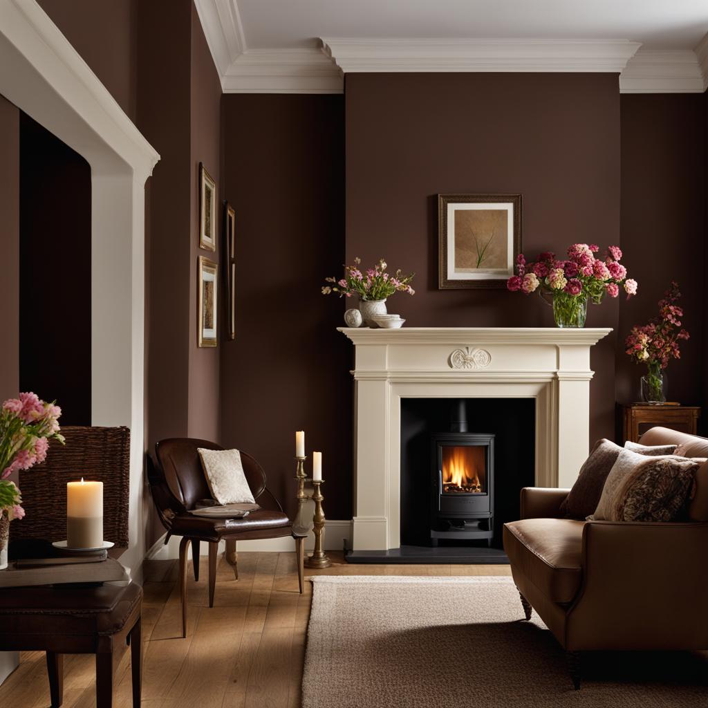
Ganache by Little Greene is a versatile brown paint color that pairs beautifully with a variety of other colors, making it ideal for creating stunning and sophisticated interiors. Whether you want to create a rustic-inspired kitchen or a tranquil bedroom, Ganache provides the perfect foundation for your design.
For a truly cozy and welcoming feel, consider using Ganache on kitchen cabinetry or bedroom walls. This rich brown shade adds depth and personality to your space, creating a warm and inviting environment. Pair it with soft neutrals, blush pinks, or even bold accent colors for a dynamic and visually appealing look.
Why Choose Ganache by Little Greene?
Ganache by Little Greene is a rich brown paint color that adds warmth and elegance to any space. Its versatility allows for endless design possibilities, making it a top choice for homeowners and interior designers alike.
Not only does Ganache create a cozy atmosphere, but it also has a timeless appeal that will stand the test of time. This paint color brings a sense of sophistication and luxury, elevating the overall look and feel of your home. Whether you’re aiming for a traditional or contemporary aesthetic, Ganache by Little Greene is a fantastic choice.
| Pros | Cons |
|---|---|
| ✔ Versatile, pairs well with a variety of colors | ✘ May be too dark for small or poorly lit spaces |
| ✔ Adds warmth and elegance to any room | ✘ Requires multiple coats for full coverage |
| ✔ Timeless appeal and sophistication | ✘ Limited availability in certain regions |
With its rich and inviting tones, Ganache by Little Greene is the perfect paint color for creating cozy and stylish spaces. Whether you’re redecorating your living room or giving your kitchen a makeover, this versatile brown shade will add warmth and elegance to your home. Embrace the trend of rich brown paint colors and transform your space into a captivating and indulgent haven.
The Calming Effect of Stardew by Sherwin-Williams
When it comes to creating a relaxing and tranquil atmosphere in your bedroom, choosing the right paint color is key. Stardew by Sherwin-Williams is a misty blue shade that possesses a soothing and calming effect, making it an ideal choice for this space. The cool undertones of this paint color create a serene ambiance that promotes rest and relaxation.
Stardew is a versatile color that can be paired with various design elements to create a cohesive and harmonious look. When combined with soft neutrals like cream or beige, it adds a touch of sophistication to the room. For a bolder look, consider incorporating deeper shades of blue or contrasting colors such as mustard yellow or coral.
Creating a peaceful bedroom environment is essential for promoting quality sleep and overall well-being. Stardew by Sherwin-Williams is a misty blue paint color that embraces the calming properties of blues, making it an excellent choice for creating a serene and tranquil bedroom retreat.
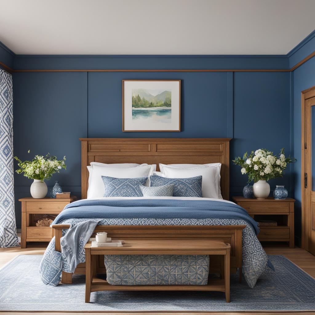
Paint Colors for a Serene Bedroom:
- Stardew by Sherwin-Williams (misty blue)
- Sea Salt by Sherwin-Williams (pale green)
- Classic Gray by Benjamin Moore (neutral gray)
- Tranquility by Benjamin Moore (soft green)
“The soothing nature of Stardew by Sherwin-Williams creates a serene atmosphere that promotes relaxation and restful sleep. Its misty blue hue is a refreshing choice for those seeking a calm and tranquil bedroom environment.” – Interior Design Expert
For those looking to create a peaceful and comforting space in their bedrooms, consider the calming effect of Stardew by Sherwin-Williams. This misty blue paint color not only adds a touch of serenity to the room but also pairs well with a variety of design styles and elements. Whether you prefer a minimalist, modern, or traditional aesthetic, Stardew is a versatile choice that can help you achieve the tranquil bedroom retreat you desire.
Fireweed by Sherwin-Williams: A Warm and Inviting Choice for Dining Rooms
When it comes to selecting paint colors for dining rooms, it’s important to choose shades that create a warm and inviting atmosphere. Fireweed by Sherwin-Williams is a beautiful warm red paint color that can transform your dining space into a cozy haven.
Fireweed exudes a sense of vibrancy and energy while still maintaining a sophisticated and elegant feel. Its warm undertones create a welcoming ambiance that encourages conversation and connection. Whether you’re hosting a formal dinner party or enjoying a casual family meal, Fireweed sets the perfect backdrop for memorable dining experiences.
This warm red paint color pairs exceptionally well with a variety of design styles and themes. For a traditional aesthetic, complement Fireweed with rich wood furniture and classic decor. If you prefer a more contemporary look, juxtapose Fireweed with sleek metal finishes and clean lines. The versatility of Fireweed allows you to personalize your dining room to reflect your unique taste and style.
Sealskin’s rich and dark tones create a visually striking backdrop that can beautifully highlight other elements in the room. It pairs wonderfully with light-colored furniture and accessories, creating a luxurious contrast that draws the eye. The deep brown shade also works well with metallic accents, adding a touch of glamour to the overall aesthetic.
In addition to its stunning visual appeal, Sealskin by Sherwin-Williams offers practical benefits for small rooms. Its deep hue has the ability to visually recede the walls, creating an illusion of more space. This makes it an excellent choice for cramped areas, where you want to create a sense of openness and airiness.
The Versatility of Sealskin
Sealskin by Sherwin-Williams is a highly versatile paint color that pairs well with various color schemes and design styles. Here are some ideas to inspire your small room transformation:
- For a modern and contemporary look, combine Sealskin with crisp whites, sleek blacks, and metallic accents.
- Create a cozy and rustic vibe by pairing Sealskin with warm neutrals like beige, cream, and camel.
- Add a pop of color by incorporating vibrant jewel tones like emerald green, sapphire blue, or deep purple alongside Sealskin.
In conclusion, Sealskin by Sherwin-Williams is a remarkable deep brown paint color that can elevate the style and ambiance of small rooms. Its luxurious appeal, versatility, and ability to visually expand the space make it an excellent choice for anyone looking to create a sophisticated and inviting atmosphere. So, if you’re considering a makeover for your compact space, give Sealskin a try and enjoy the transformation it brings.
Cracked Pepper by Behr: Embracing Black Paint as a Neutral for Modern Interiors
When it comes to choosing paint colors for modern interiors, black is no longer just a color associated with darkness and mystery. In fact, black has emerged as a bold and sophisticated choice that can add a touch of elegance and modernity to any space. One standout black paint color that is gaining popularity in 2024 is Cracked Pepper by Behr.
Cracked Pepper by Behr is a rich and deep black paint color that can be used as a neutral backdrop to create a striking contrast with other colors. Its versatility allows it to be paired with a variety of shades, from bright and vibrant hues to soft and muted tones. Whether you want to create a dramatic and moody atmosphere or a sleek and minimalist aesthetic, Cracked Pepper can help you achieve your desired look.
One of the key advantages of using Cracked Pepper as a neutral is its ability to highlight textures and architectural details in a space. When applied to walls or furniture, this black paint color can make surfaces appear more refined and visually interesting. It also works well with different materials, such as wood, metal, and stone, adding depth and sophistication to the overall design.
“Black is not just a color, it’s a statement. Cracked Pepper by Behr allows you to embrace the boldness of black paint and transform your modern interiors into sleek, contemporary spaces that exude sophistication and style.” – Interior Design Expert
So, whether you’re looking to create a sleek and modern living room, a chic and luxurious bedroom, or a sophisticated dining area, consider using Cracked Pepper by Behr as your go-to black paint color. Its versatile and timeless appeal makes it a great choice for those who want to make a statement in their modern interiors.
| Pros | Cons |
|---|---|
|
|
Overall, Cracked Pepper by Behr offers a fresh and contemporary take on black paint, allowing you to embrace the timeless elegance of this color in your modern interiors. Its ability to serve as a neutral backdrop while adding depth and character makes it a versatile choice for those seeking a sophisticated and stylish aesthetic.
Crystalline by Benjamin Moore: Inviting Green-Gray Paint Colors for Dining Rooms
When it comes to choosing the perfect paint color for your dining room, Crystalline by Benjamin Moore is an inviting green-gray shade that deserves your attention. This color reflects plenty of light, creating a softer and more welcoming atmosphere than bright white. Its green-gray undertones add a touch of color without overwhelming the room, making it a versatile choice for various interior styles.
In a dining room, the right paint color can set the mood and create a warm and inviting space for sharing meals with loved ones. Crystalline’s subtle green undertones bring a sense of nature and freshness, making it perfect for those who want to create a peaceful and serene ambiance.
Pair Crystalline with natural elements like wooden furniture, botanical prints, and soft textured accents to enhance its organic vibe. This paint color works well with different styles, from traditional to contemporary, and complements a variety of dining room decor and furnishings. Whether you prefer a formal or casual dining space, Crystalline by Benjamin Moore is an excellent choice to make your dining room feel cozy, inviting, and stylish.
When it comes to painting your dining room, Crystalline by Benjamin Moore offers a fresh and inviting green-gray hue that is perfect for creating a peaceful and warm ambiance. With its subtle natural undertones, this paint color pairs beautifully with a variety of decor styles and furnishings. Whether you want a traditional or contemporary dining room, Crystalline provides a versatile and stylish backdrop for enjoying meals with loved ones. Pair it with natural elements and soft textures to enhance its organic feel and transform your dining space into a haven of comfort and serenity.
Night Owl by Benjamin Moore: A Cozy and Elegant Choice for Living Rooms
If you’re looking to create a warm and inviting atmosphere in your living room, Night Owl by Benjamin Moore is the perfect paint color for you. This warm chestnut shade brings a sense of coziness and elegance to any space, making it ideal for creating a relaxing and sophisticated retreat. Whether you have wood trim or not, Night Owl pairs beautifully with a variety of other colors and finishes, allowing you to create a captivating and personalized interior design statement.
With its rich and earthy undertones, Night Owl adds depth and warmth to your living room. This paint color works particularly well in larger spaces where it can truly shine and create a cozy ambiance. Pair it with neutrals like cream or beige for a classic and timeless look, or go bold with pops of color like burnt orange or deep red for a more dramatic and eclectic feel.
When choosing Night Owl for your living room, consider the natural lighting in the space. This warm chestnut shade complements both natural and artificial light, creating a space that feels welcoming and inviting throughout the day. Whether your living room is flooded with sunlight or tends to be on the darker side, Night Owl will enhance the overall atmosphere and make it feel like a true sanctuary.
Transform your living room into a cozy and elegant retreat with Night Owl by Benjamin Moore. This warm chestnut paint color brings a touch of sophistication and comfort to any space, making it the perfect choice for creating a welcoming and inviting atmosphere. Whether you have wood trim or not, Night Owl pairs beautifully with a variety of colors, allowing you to personalize your living room and create a space that truly reflects your style and personality.
Top Paint Color Trends for 2024
As we approach 2024, it’s exciting to explore the emerging paint color trends that will shape interior design in the coming year. Design experts predict a shift towards bolder and moodier shades, moving away from the cooler gray tones that have dominated recent years. These upcoming trends celebrate the beauty of rich browns, warm reds, misty blues, and deep, elegant neutrals.
One of the top picks for 2024 is the use of vibrant and captivating colors that add drama and depth to interior spaces. We can expect to see an increase in the demand for hues like warm crimson, soothing lavender, and a unique shade called “Mattel Blue.” These bold colors create a striking contrast and make a powerful statement in any room.
Another key trend for 2024 is the resurgence of classic colors with earthy undertones. Shades of mauve, deep purples, and rich browns are making a comeback as timeless and sophisticated options. These colors bring warmth and elegance to any space and can be paired beautifully with wood trim, creating a harmonious and inviting atmosphere.
| Emerging Paint Color Trends for 2024 | Description |
|---|---|
| Vibrant and Captivating Colors | Shades like warm crimson and soothing lavender add drama and depth to interior spaces. |
| Classic Colors with Earthy Undertones | Mauve, deep purples, and rich browns are making a comeback as timeless and sophisticated options. |
| Misty Blues | Soft blues like Stardew create a calming atmosphere, perfect for bedrooms and living rooms. |
Lastly, misty blues are set to make a big impact in 2024. Shades like Stardew by Sherwin-Williams bring a sense of tranquility and serenity to any space. These soft blues are perfect for creating a calming atmosphere in bedrooms and living rooms. Their balance of warm and cool undertones adds intrigue and depth, making them a top pick for the upcoming year.
Whether you’re looking to embrace bold and vibrant colors or prefer the classic and timeless appeal of earthy neutrals, the 2024 paint color trends offer a wide range of options to suit every style and preference. Keep an eye on these emerging trends as you plan your next interior design project, and let your creativity flow with the transformative power of color.
Expert Insights on Future Paint Color Trends
“2024 will see a return to bold and moody colors, with a focus on vibrant oranges, soothing lavenders, and a unique ‘Mattel Blue.’ Earthy undertones and warm hues like deep purples and rich browns will also be in high demand. Classic colors such as navy blue, camel, deep browns, olive greens, and reds are making a comeback, adding depth and sophistication to interior spaces.” – Design Expert
- 2024 paint color trends will focus on bold and moody shades.
- Classic colors with earthy undertones will regain popularity.
- Misty blues will create a calming atmosphere in bedrooms and living rooms.
Expert Predictions for 2024 Paint Color Trends
As we delve into the realm of 2024, industry experts have shared their insights and predictions for the upcoming paint color trends. A departure from the subdued and neutral tones of recent years, the forecast for 2024 suggests a shift towards bolder and more vibrant hues that inject personality and character into interior spaces. From lively oranges to soothing lavenders and even a unique “Mattel Blue,” the color palette for 2024 is set to be captivating and diverse.
One of the focal points of the predictions is the emphasis on earthy undertones, veering away from the cool gray tones that have dominated in the past. Designers are embracing shades of mauve, deep purples, and rich browns as timeless and sophisticated options. These warm hues evoke a sense of comfort and indulgence, creating a cozy atmosphere in any room.
Classic colors are also making a comeback in 2024, with navy blue, camel, deep browns, olive greens, and red taking the center stage. These enduring shades add depth and richness to various spaces, allowing homeowners to create captivating interiors that stand the test of time.
It’s important to note that these predictions provide valuable insights into the direction of paint color trends for 2024. However, personal preferences and individual style should always take precedence when choosing the perfect colors for your home. Whether you opt for the bold and vibrant or prefer a more understated palette, the most important aspect is creating a space that reflects your personality and brings you joy.
The Future of Interior Design: Bold and Vibrant
In 2024, interior design is set to embrace the power of color, with bold and vibrant choices becoming the new norm. This shift towards more expressive and daring shades allows homeowners to infuse their spaces with energy and individuality. Whether it’s a pop of orange to create a lively atmosphere or a splash of lavender for a soothing sanctuary, the possibilities are endless.
| Color | Description |
|---|---|
| Orange | A vibrant and energetic color choice, perfect for creating a lively and dynamic space. |
| Lavender | A soothing and calming hue that brings a sense of tranquility to any room. |
| Mattel Blue | An unconventional blue shade that adds a touch of playfulness and creativity to interiors. |
These colors, along with the resurgence of classic tones like navy blue and deep browns, offer homeowners the opportunity to make a statement and express their unique style. Whether it’s through a feature wall, furniture accents, or even ceiling treatments, the use of bold and vibrant colors will undoubtedly shape the interior design landscape in 2024.
As with any trend, it’s essential to consider your personal taste and the overall aesthetic you want to achieve in your home. While these expert predictions provide valuable insights into the future of paint color trends, it’s ultimately up to you to create a space that brings you joy and speaks to your individuality.
Conclusion
As we wrap up our exploration of the top paint color trends for 2024, it’s clear that bold and moody shades are taking center stage. From rich browns to vibrant oranges and soothing blues, there are plenty of options to suit every style and preference. And when it comes to pairing these colors with wood trim, the results can be truly stunning.
Whether you’re aiming for a warm and cozy atmosphere or a sophisticated and elegant vibe, there are paint colors that will beautifully complement your wood trim. Chinese Blue by Farrow & Ball and London Clay by Farrow & Ball are two top picks that exude timeless warmth and character. Ganache by Little Greene is another standout choice for creating captivating and indulgent spaces. And if you’re looking to add a calming touch, Stardew by Sherwin-Williams or Crystalline by Benjamin Moore are excellent options.
As we enter 2024, don’t be afraid to embrace the power of color and make a bold statement in your home. Consider expert predictions for paint color trends and explore the rich palette of possibilities. Remember, paint colors have the ability to transform a space and evoke different emotions. So, take your time, experiment with different shades and combinations, and find the perfect paint color that brings out the best in your wood trim and reflects your personal style.
FAQ
What are the best paint colors for wood trim?
Some of the best paint colors for wood trim in 2024 include Chinese Blue by Farrow & Ball, London Clay by Farrow & Ball, Ganache by Little Greene, Stardew by Sherwin-Williams, and Fireweed by Sherwin-Williams. These colors bring warmth, character, and a touch of elegance to your space.
Which paint colors work well with light-filled kitchens and living rooms?
Chinese Blue by Farrow & Ball is a standout choice for light-filled kitchens and living rooms. Its bold shade of blue adds a punch of joyful exuberance to your space and pairs beautifully with neutral hues or contrasting colors like hot pink.
What paint colors are suitable for poorly lit spaces like narrow hallways?
London Clay by Farrow & Ball is a rich brown paint color that adds warmth and sophistication to poorly lit spaces like narrow hallways. It can be paired with a variety of other colors, including pinks, greens, blues, and earthy neutrals.
What are some cozy and inviting paint colors for creating captivating spaces?
Ganache by Little Greene is a trending brown paint color that creates a cozy and inviting atmosphere. It works well with other colors, including pinks, greens, blues, and brighter accent colors, making it perfect for kitchen cabinetry or bedroom walls.
What paint color is ideal for creating a calming atmosphere in bedrooms and living rooms?
Stardew by Sherwin-Williams is a misty blue paint color that has a calming effect. It is great for bedrooms and living rooms, as blues like Stardew are associated with calmness and resting. The warm and cool undertones of this shade of blue add intrigue to your space.
How can red paint colors be used to create a welcoming atmosphere?
Fireweed by Sherwin-Williams is a warm red paint color that adds warmth and an uplifting ambiance to a space. When used in the right tone and space, red creates a welcoming and inviting atmosphere. Fireweed’s mineral and earthy character make it perfect for dining rooms and kitchens.
What paint color creates a sleek and refined look in smaller rooms?
Sealskin by Sherwin-Williams is a deep and bold brown paint color that creates a sleek and refined look. It works particularly well in smaller rooms like TV rooms or hallways, as it creates a theater-like and cozy environment. This rich shade of brown pairs well with a variety of other colors and finishes.
How can black paint be used to add modernity and elegance to a space?
Cracked Pepper by Behr is a bold black paint color that adds a sense of modernity and timeless elegance to any space. It can be used as a backdrop for home furnishings and can be paired with a variety of other colors for a dynamic look.
What paint color creates a soft and welcoming look in dining rooms?
Crystalline by Benjamin Moore is an inviting green-gray paint color that reflects plenty of light and creates a softer look than bright white. It is a great choice for dining rooms as it provides a welcoming and warm space without overwhelming the room.
What paint color creates a cozy and elegant retreat in living rooms?
Night Owl by Benjamin Moore is a warm chestnut paint color that creates a cozy and elegant retreat in living rooms. It pairs well with a variety of other colors, allowing you to create a captivating and sophisticated interior design statement.
What are the top paint color trends for 2024?
The top paint color trends for 2024 include a shift towards bolder and moodier shades. Vibrant oranges, soothing lavenders, and a unique “Mattel Blue” are predicted to be popular choices. Earthy undertones and a move away from cool gray tones are also expected.
What are the expert predictions for 2024 paint color trends?
Experts predict a shift towards bolder colors, such as vibrant oranges, soothing lavenders, and a unique “Mattel Blue.” There is also a focus on earthy undertones and a move away from cool gray tones. Shades of mauve, deep purples, and rich browns are expected to be timeless and sophisticated options.
How do I choose the perfect paint color for my wood trim?
When choosing a paint color for your wood trim, it’s important to consider the overall look and feel you want to achieve in your space. Experiment with different shades and combinations to find the perfect color that complements your wood trim beautifully. Whether you prefer a warm and cozy atmosphere or a sophisticated and elegant vibe, there are paint colors that will suit your style and preference.