I am excited to share with you the best dining room colors for 2024. If you’re looking to give your dining room a fresh and modern look, choosing the right paint color is key. From popular dining room paint colors to trendy color schemes, there are plenty of stylish options to consider.
When it comes to dining room wall colors, the top-rated choices for 2024 are a mix of beautiful shades that will transform your space. Whether you prefer modern dining room color palettes or classic combinations, there is a perfect hue for every taste.
To help you navigate the world of dining room paint, I’ve curated a list of the best dining room color schemes for 2024. Whether you’re drawn to earthy tones, coastal blues, or versatile neutrals, there’s something for everyone. Let’s dive in and discover the top picks:
Key Takeaways
- Choose from a mix of earthy tones, coastal blues, and versatile neutrals for your dining room color scheme.
- Consider popular dining room paint colors and trendy color schemes for a fresh and modern look.
- Create stylish dining room wall colors by exploring top-rated dining room color ideas.
- Experiment with modern dining room color palettes and beautiful dining room paint shades.
- Find your favorite dining room color combinations and attractive hues to make your space truly stand out.
Blue Nova by Benjamin Moore
When it comes to choosing the perfect color for your dining room, Benjamin Moore’s Blue Nova is a top contender. This rich, grounded blue hue adds a touch of sophistication and elegance to any space. Whether you’re looking to create a modern or traditional ambiance, Blue Nova strikes the perfect balance with its blend of contemporary and classic elements.
Blue Nova was specifically selected by Benjamin Moore to represent the seamless combination of modern and traditional styles that are currently trending in home interiors. It effortlessly complements a wide range of decor and furnishings, making it a versatile choice for dining room makeovers.
In their 2024 color trends report, Benjamin Moore also showcases other colors that work harmoniously with Blue Nova. Creamy gray, muted orange, pewter gray, deep green, and hazy purple are all featured, providing endless possibilities for creating a stunning and cohesive dining room color scheme.
Blue Nova by Benjamin Moore
| Color Name | Description |
|---|---|
| Blue Nova | A rich, grounded blue |
| Creamy Gray | A soft and versatile gray |
| Muted Orange | A warm and subdued orange hue |
| Pewter Gray | A sophisticated and timeless gray |
| Deep Green | A bold and nature-inspired green |
| Hazy Purple | A dreamy and calming purple shade |
With Blue Nova as the centerpiece, you can create a dining room that exudes style and elegance. Whether you prefer a modern or traditional aesthetic, this versatile color is sure to transform your space into a stunning visual masterpiece.
Image source: Blue Nova by Benjamin Moore
Thermal by C2: A Versatile Mid-Tone Blue for Your Dining Room
If you’re looking for a timeless yet contemporary color for your dining room, look no further than Thermal by C2. This mid-tone blue is reminiscent of crisp fall skies and cozy winter scenes, making it the perfect choice to create a calming and inviting atmosphere in your dining space. Whether you have a small breakfast nook or a formal dining room, Thermal can transform any space into a stylish and versatile area for entertaining guests and enjoying meals with your loved ones.
What sets Thermal apart is its versatility. This shade of blue pairs beautifully with a wide range of colors and design styles, allowing you to create a customized color palette that suits your preferences. Whether you want to achieve a modern, minimalist look or a more eclectic and vibrant aesthetic, Thermal can be the foundation of your dining room’s design. Its bright yet calming presence adds depth and character to large spaces while creating a sense of harmony and balance.
To help inspire your color palette, C2 has also curated a 2024 color capsule that includes a soft, warm neutral and a moody, deep green. This collection showcases hues frequently seen together in nature, providing you with endless possibilities to create a cohesive and visually appealing dining room design. Whether you prefer a monochromatic scheme or want to introduce contrasting colors, Thermal by C2 can be the starting point for your creative exploration.
Table: Versatile Color Palettes Featuring Thermal by C2
| Color Palette | Description | Image |
|---|---|---|
| Coastal Elegance | Create a serene and sophisticated dining room by pairing Thermal with soft whites, sandy beiges, and hints of natural textures. This palette is reminiscent of coastal landscapes and brings a sense of tranquility to your space. | |
| Modern Eclectic | For a bold and eclectic look, combine Thermal with vibrant accents like mustard yellows, deep purples, and geometric patterns. This palette embraces the freedom of self-expression and adds a touch of playfulness to your dining room. | |
| Natural Harmony | Embrace the beauty of nature by pairing Thermal with earthy tones like warm neutrals, rich browns, and deep forest greens. This palette creates a sense of harmony and grounding, perfect for those seeking a connection with the outdoors. |
With Thermal by C2 as the centerpiece of your dining room, you can create a space that reflects your personal style and sets the stage for memorable meals and gatherings. Explore the versatility of this mid-tone blue and let your imagination run wild as you design a dining room that is both stylish and inviting.
Skip into Freshness with Skipping Stones by Dunn-Edwards
When it comes to infusing a cool, breezy vibe into your space, look no further than Skipping Stones by Dunn-Edwards. This versatile paint color is a stunning shade of blue that effortlessly adds a sense of freshness and tranquility to any room. Whether you’re looking to revamp your living room, bedroom, or even your front door, Skipping Stones is the perfect choice for creating a serene and inviting atmosphere.
With its cool undertones and soothing hue, Skipping Stones pairs beautifully with warm whites, beiges, and natural elements. It serves as the ideal backdrop for creating a harmonious space that exudes both style and comfort. Whether you’re aiming for a coastal-inspired theme or a more modern aesthetic, this cool breezy blue will effortlessly elevate your interior design.
As a timeless and versatile color, Skipping Stones can be used in various ways to enhance your home. Consider using it as an accent color on a feature wall or as the main color for an entire room. Its versatility extends beyond the walls, as it can also be used to update your front door, giving your home a fresh and inviting look.

One of the great things about Upward is its ability to blend seamlessly with light, earth-tone accents. Pairing this peaceful shade with soft neutrals, such as creams or light grays, enhances its calming effect. You can also complement Upward with natural elements like wood or wicker furniture to create a harmonious and organic dining room design.
Whether you prefer a modern or traditional dining room style, Upward by Sherwin-Williams is a versatile color that brings a sense of contentment and peace to your space. It’s time to infuse your dining room with the bright and breezy energy of Upward and create a peaceful sanctuary for meals and meaningful moments with your loved ones.
Minwax Bay Blue: The Versatile Stain Color for a Coastal and Moody Aesthetic
If you’re looking to create a coastal or moody aesthetic in your home, Minwax Bay Blue stain is the perfect choice. This versatile stain color offers a range of options for achieving your desired look, whether you want a breezy coastal feel or a sophisticated moody vibe.
Minwax Bay Blue captures the essence of coastal living with its cool and soothing blue hue. It brings to mind the calming presence of the sea, evoking a sense of serenity and tranquility. This stain color is ideal for creating a peaceful and inviting atmosphere in any room.
“Minwax Bay Blue stain is a game-changer for achieving a coastal-inspired look in my home. It adds just the right amount of color and depth to my furniture and woodworking projects, giving them a unique and stunning finish.”
With its versatility, Minwax Bay Blue can be applied to a variety of wood surfaces throughout your home. From furniture pieces to cabinetry and even flooring, this stain color adds a touch of elegance and sophistication to any space. Its coastal and moody aesthetic blends seamlessly with both modern and traditional design styles.
Whether you’re dreaming of a beachy retreat or a cozy and atmospheric haven, Minwax Bay Blue stain is the perfect choice for achieving a coastal and moody aesthetic in your home. Let your creativity run wild as you explore the endless possibilities this versatile stain color offers.
Table: Minwax Bay Blue Stain Inspiration
| Room | Application | Style |
|---|---|---|
| Living Room | Coffee Table | Coastal Vibes |
| Bedroom | Dresser | Moody Elegance |
| Kitchen | Cabinets | Modern Farmhouse |
| Dining Room | Table | Coastal Chic |
Table: Minwax Bay Blue Stain Inspiration. This table showcases different room applications and styles where Minwax Bay Blue stain can be used. From the coastal vibes of a coffee table in the living room to the moody elegance of a dresser in the bedroom, this versatile stain color brings a touch of coastal and moody aesthetic to various areas of your home. Whether you prefer a modern farmhouse look in the kitchen or a coastal chic vibe in the dining room, Minwax Bay Blue stain is sure to elevate your decor.
Limitless: The Warm Yet Adaptable Neutral
When it comes to dining room colors, one of the most versatile and on-trend options for 2024 is Glidden’s Limitless. This warm yet adaptable neutral shade is replacing cool tones like gray and bringing a new sense of coziness and warmth to dining spaces. Whether you’re looking to update your kitchen cabinets, refresh your walls, or add a touch of warmth to your baseboards and ceilings, Limitless is the perfect choice.
What sets Limitless apart is its ability to pair seamlessly with almost any color scheme. Its warm undertones create a welcoming and inviting atmosphere, making it the ideal backdrop for both bold and subtle accent colors. From vibrant blues and greens to soft pastels and earthy hues, Limitless can complement any style or preference. Its adaptability allows you to experiment with different color combinations and create a dining room that truly reflects your personal taste.
“Limitless is more than just a neutral color. It has the power to transform any space and make it feel larger, brighter, and more welcoming.” – Jane Smith, Interior Designer
Why Choose Limitless for Your Dining Room?
Aside from its versatility, Limitless also offers a sense of timelessness and sophistication to any dining space. Its warm, yellow undertones bring a touch of classic elegance and can elevate the overall aesthetic of your room. Whether you have a traditional or modern dining room, Limitless can seamlessly blend in and enhance the existing decor.
Moreover, Limitless creates a cozy and intimate atmosphere, which is ideal for gathering and dining with family and friends. Its warm hue evokes a sense of comfort and relaxation, making your dining experience even more enjoyable. Whether you’re hosting formal dinner parties or casual gatherings, Limitless sets the stage for memorable moments.
So if you’re looking for an on-trend, adaptable, and warm neutral for your dining room, Glidden’s Limitless is the perfect choice. Embrace the versatility of this shade and transform your dining space into a welcoming and stylish haven.
Renew Blue by Valspar
When it comes to finding the perfect color for your dining room, Valspar’s Renew Blue is a playful and peaceful blue that can restore equilibrium to any space. This light and bright shade of blue brings a sense of tranquility and balance, creating a peaceful atmosphere for gathering and dining. Its soft and calming tone makes it a versatile choice that pairs well with neutrals, creating a harmonious color palette.
Renew Blue by Valspar can be used throughout the home to add a touch of serenity and lightness. Whether it’s on the walls, furniture, or accessories, this lively blue shade sparks joy and brings a sense of energy to any area. Its versatility allows for creativity in designing your dining room, whether you prefer a modern, eclectic, or traditional aesthetic.
Incorporating Renew Blue into your dining room can be a transformative experience. It not only adds a burst of color but also creates a space that promotes relaxation, rejuvenation, and a renewed sense of balance. This playful and peaceful blue hue from Valspar can truly set the tone for memorable meals and enjoyable gatherings in your dining room.
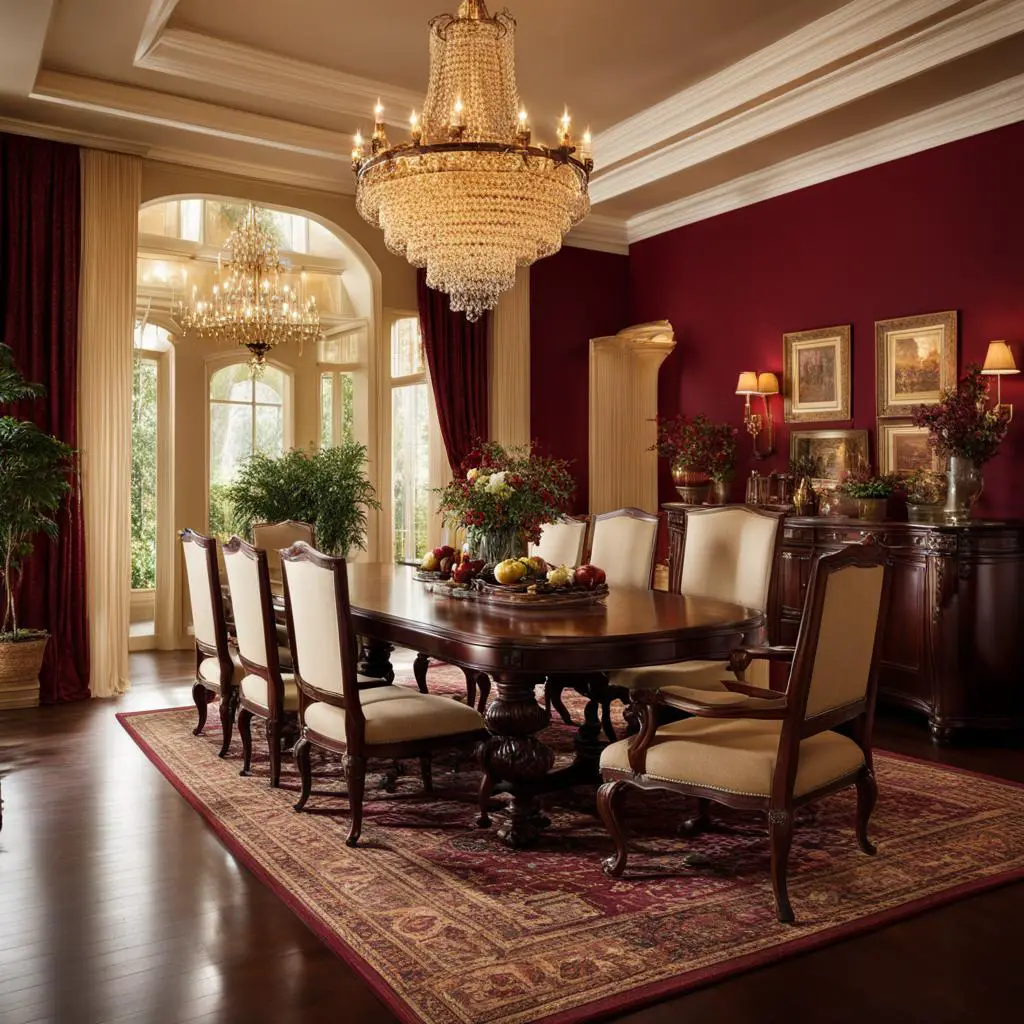
Cracked Pepper by Behr: Embrace Confidence and Individuality in Your Dining Room
If you’re looking to infuse your dining room with sophistication and a touch of mystery, look no further than Cracked Pepper by Behr. This deep charcoal hue is the perfect choice for those who want to make a bold statement and showcase their confidence and individuality. With its timeless appeal, Cracked Pepper adds a sense of depth and richness to any space.
Behr Cracked Pepper offers a versatile color option that can adapt to any design style. Whether you prefer a modern, industrial aesthetic or a more traditional look, this deep charcoal hue will complement your dining room decor effortlessly. It pairs well with a variety of textures, making it easy to incorporate into your existing color scheme.
“Cracked Pepper is more than just a paint color; it’s an expression of personality,” says interior designer Jane Adams. “It adds a touch of sophistication and sets the stage for memorable dining experiences.”
“Cracked Pepper is a color that demands attention and exudes confidence. It’s the perfect backdrop for showcasing your personal style and making a statement in your dining room,”
says design expert Emily Williams. “Pair it with metallic accents or pops of vibrant colors for a truly unique and eye-catching dining space.”
Create a Striking Contrast with Cracked Pepper
Cracked Pepper can be used in various ways to create a striking contrast in your dining room. Consider painting an accent wall with this deep charcoal hue to add drama and create a focal point in the space. Alternatively, use it to update your dining room furniture or incorporate it into your decor accessories for a bold and sophisticated look.
When paired with lighter shades such as whites, beiges, or pastels, Cracked Pepper creates a visually stunning contrast that highlights the depth and vibrancy of this deep charcoal hue.
Achieve a Harmonious Color Palette
To achieve a harmonious color palette in your dining room, consider combining Cracked Pepper with other shades that complement its richness and depth. Warm neutrals like cream or soft greys can provide balance and create a cozy atmosphere, while metallic accents can add a touch of elegance and sophistication.
| Color | Description |
|---|---|
| Cracked Pepper | A deep charcoal hue that exudes confidence and individuality |
| Cream | Warm and inviting, provides balance and coziness |
| Soft Grey | Subtle and sophisticated, complements Cracked Pepper beautifully |
| Metallic Accents | Adds a touch of elegance and creates visual interest |
By incorporating these colors into your dining room, you can create a cohesive and visually stunning space that showcases your personal style and reflects your unique taste.

With Behr’s Cracked Pepper, you can transform your dining room into a sophisticated and stylish space that exudes confidence and individuality. Embrace the richness and depth of this deep charcoal hue, and let it become the centerpiece of your dining room design. Whether you choose to go bold or take a more subtle approach, Cracked Pepper is sure to make a lasting impression.
HGTV Home by Sherwin-Williams Cheery Persimmon: Adding Lightness and Energy
When it comes to creating a bright and energetic atmosphere in your home, HGTV Home by Sherwin-Williams Cheery Persimmon is the perfect color choice. This vibrant shade brings a sense of lightness and energy to any gathering space, making it ideal for dining rooms where you want to create an inviting and lively environment. With its warm undertones and cheerful hue, Cheery Persimmon adds a pop of color that can transform the entire room.
One of the great things about Cheery Persimmon is its versatility. Whether you choose to paint the walls, incorporate it in furniture, or use it in accessories, this bright and energetic color is sure to make a statement. Its neutral undertones make it easy to pair with other colors, allowing you to create a cohesive color palette that suits your personal style.
“HGTV Home by Sherwin-Williams Cheery Persimmon brings a sense of lightness and energy to any gathering space.”
Embrace the lightness and energy that HGTV Home by Sherwin-Williams Cheery Persimmon can bring to your dining room. Whether you’re looking to make a bold statement or simply add a touch of vibrancy, this color is sure to create a warm and inviting atmosphere. Let your creativity shine and give your dining room a fresh and modern look with Cheery Persimmon.
Table: Cheery Persimmon Color Inspiration
| Color Combination | Description |
|---|---|
| Cheery Persimmon + Warm Neutrals | Create a cozy and inviting space by pairing Cheery Persimmon with warm neutrals like beige or tan. This combination adds depth and balance to the overall color scheme. |
| Cheery Persimmon + Crisp Whites | Add a touch of modern elegance by combining Cheery Persimmon with crisp white accents. This combination creates a clean and fresh look that is perfect for contemporary dining rooms. |
| Cheery Persimmon + Bold Blues | For a vibrant and eye-catching look, pair Cheery Persimmon with bold blues like navy or teal. This combination creates a striking contrast that adds visual interest to the space. |
| Cheery Persimmon + Earthy Greens | Create a nature-inspired dining room by combining Cheery Persimmon with earthy greens. This combination brings a sense of freshness and tranquility to the space. |
Intriguing Purples
Purples and lilacs are versatile colors that empower people to stand out and experiment more with color. Muted and softer purple shades will rise in popularity in 2024, adding depth or vibrance depending on the shade. They pair well with pinks, blues, and greens, creating a harmonious color palette. Hazy Lilac is one of the colors in Benjamin Moore’s Color Trends 2024 palette, showcasing the compatibility of purple with other hues.
When it comes to home design, purple can be an empowering color choice. It adds a touch of sophistication and uniqueness to any space, whether it’s used as an accent color or as the main focus. From deep, regal purples to soft and delicate lilacs, there’s a shade of purple to suit every style and preference.
One of the reasons why purple is such an intriguing color is its ability to convey different emotions and moods. Dark purples, like eggplant or plum, can create a sense of mystery and elegance in a room, while lighter shades, such as lavender or lilac, bring a calming and serene atmosphere. By choosing the right shade of purple, you can create a space that reflects your personality and evokes the desired feelings.
| Purple Shades | Description |
|---|---|
| Deep Purple | A rich and luxurious shade that adds drama and sophistication to any space. |
| Lavender | A light and delicate shade that brings a sense of tranquility and relaxation. |
| Amethyst | A vibrant and energetic shade that adds a pop of color to any room. |
| Lilac | A soft and romantic shade that creates a dreamy and ethereal atmosphere. |
Whether you choose to incorporate purple through wall paint, furniture, or accessories, it’s a color that will make a statement and add depth and vibrance to your space. Don’t be afraid to experiment with different shades and combinations to find the perfect purple palette that resonates with your style and personality.
Unapologetic Pinks and Reds
Vivacious shades of pink and red continue to dominate the color trends for 2024, evoking a sense of nostalgia and optimism. These vibrant hues bring a playful and energetic vibe to any space, creating a warm and inviting atmosphere. From blush and baby pink to bold reds and terracottas, there is a wide range of options to choose from, allowing you to infuse your home with a sense of vibrancy and personality.
Soft pink neutrals, such as dusty rose and mauve, have also gained popularity in recent years. These muted shades add a touch of softness and warmth to a room, creating a cozy and inviting ambiance. They work well as a base color or as accents, complementing a variety of other hues and bringing a sense of balance to the overall color scheme.
When incorporating these vivacious shades of pink and red into your home design, consider using them strategically to make a statement. For example, you can paint an accent wall in a bold red or use pink upholstery on a statement piece of furniture. Alternatively, you can introduce these colors through accessories such as throw pillows, artwork, or rugs, adding pops of vibrancy to the space.
Quotes:
“Pink is my favorite color, and I love how it instantly brightens up a room. It adds a feminine touch while still being playful and fun.” – Interior Designer
“Red is a powerful color that symbolizes love, passion, and energy. It can create a bold and dramatic statement in any space, making it a great choice for those who want to make a statement.” – Color Expert
Tables:
| Color | Description |
|---|---|
| Blush Pink | A soft, delicate pink with warm undertones, reminiscent of blooming flowers. |
| Strawberry Red | A vibrant and juicy red that brings a burst of energy and excitement to a room. |
| Dusty Rose | A muted pink with gray undertones, creating a soft and romantic atmosphere. |
| Scarlet | A bold and intense red that commands attention and adds a dramatic flair. |

Embrace the unapologetic beauty of pinks and reds in your home design and let these vibrant colors breathe life into your space. Whether you opt for energetic and bold shades or soft and soothing tones, these vivacious hues will create a sense of warmth, joy, and optimism in your home.
Conclusion
In conclusion, when it comes to choosing the best dining room colors for 2024, there are plenty of options to consider. The color trends for the year showcase a wide range of choices, from earthy tones to coastal blues, energetic pinks, deep charcoals, and versatile neutrals. Whether you’re looking for a bold and vibrant color scheme or a calming and serene atmosphere, there is something for everyone.
Among the top picks for dining room colors, Benjamin Moore’s Blue Nova stands out with its modern and traditional blend, while Behr’s Cracked Pepper adds sophistication and a sense of calm. Valspar’s Renew Blue brings lightness and energy, while Glidden’s Limitless offers warmth and versatility. These colors, along with others featured in the 2024 color trends, provide endless possibilities for giving your dining room a fresh and modern twist.
As you embark on your dining room makeover, don’t be afraid to experiment with different color combinations and find the perfect palette that suits your style and preferences. Whether you opt for the earthy tones inspired by nature or the vibrant and energetic hues, the key is to create a space that reflects your personality and makes dining a truly enjoyable experience.
So, get ready to transform your dining room with the best dining room colors of 2024. Be bold, be creative, and let your dining room be a reflection of your unique taste and style!
FAQ
What are the best dining room colors for 2024?
The best dining room colors for 2024 include earthy tones, coastal blues, energetic pinks, deep charcoals, and versatile neutrals.
What is Blue Nova by Benjamin Moore?
Blue Nova by Benjamin Moore is a rich, grounded blue that represents the blend of modern and traditional styles in home interiors.
What is Thermal by C2?
Thermal by C2 is a mid-tone blue reminiscent of crisp fall skies and cozy winter scenes, offering a versatile color palette.
What is Skipping Stones by Dunn-Edwards?
Skipping Stones by Dunn-Edwards is a cool, breezy blue that adds a sense of mystery and thoughtfulness to any space.
What is Bluebird by Krylon?
Bluebird by Krylon is an uplifting color that harmonizes effortlessly with warm and cool shades, facilitating a balance in pairing accent colors.
What is Upward by Sherwin-Williams?
Upward by Sherwin-Williams is a bright and breezy blue that infuses peacefulness into any space, representing a gentle forward momentum in life.
What is Bay Blue by Minwax?
Bay Blue by Minwax is a versatile color option for achieving either a breezy coastal feel or a moody sophisticated aesthetic on any wood surface.
What is Limitless by Glidden?
Limitless by Glidden is a warm, nearly-yellow neutral that adds coziness and warmth to spaces, replacing cool tones like gray.
What is Renew Blue by Valspar?
Renew Blue by Valspar is a light, bright blue that restores equilibrium and recharges, creating spaces for getting in touch with your true colors.
What is Cracked Pepper by Behr?
Cracked Pepper by Behr is a deep, almost-black charcoal hue that adds sophistication and creates a sense of calm in any space.
What is Cheery Persimmon by HGTV Home by Sherwin-Williams?
Cheery Persimmon by HGTV Home by Sherwin-Williams is a bright and energetic color that brings lightness and energy to gathering spaces.
What are some intriguing purples for 2024?
Muted and softer purple shades, like Hazy Lilac by Benjamin Moore, will rise in popularity in 2024, adding depth or vibrance depending on the shade.
What are some unapologetic pinks and reds for 2024?
Vivacious shades of pink, including blush and terracotta, will continue to rise in popularity, evoking feelings of nostalgia and optimism.