

Giving your ceilings a fresh coat of paint can completely transform a room and add personality to your space. But with so many color options available, how do you choose the best color for your ceilings? In this article, I will explore the top picks and ideas for ceiling colors in 2024, providing inspiration for your next interior design project.
Key Takeaways:
- Explore the 2024 color trends, including earthy tones, coastal-inspired blues, and moody forestcore-inspired picks.
- Top picks for modern and traditional styles include Benjamin Moore’s Blue Nova and C2’s Thermal.
- Create a calming atmosphere with cool blues like Dunn-Edwards’ Skipping Stones and Valspar’s Renew Blue.
- Add warmth and sophistication with cozy browns and warm neutrals like Little Greene’s Ganache and Glidden’s Limitless.
- Consider the overall color scheme and design style of the room when choosing a ceiling color.
Incorporating Earthy Tones for a Natural Vibe
Incorporating earthy tones in interior design can bring a natural and organic vibe to any space. These colors, inspired by nature, create a sense of warmth, tranquility, and harmony. When used on ceilings, earthy tones can add depth and interest to a room, creating a unique and inviting atmosphere.
Some popular earthy tones for ceilings include Benjamin Moore’s Blue Nova and C2’s Thermal. Blue Nova, with its grounded blue shade, adds a serene and calming effect to a space. Thermal, a mid-tone reminiscent of fall skies, creates a cozy and comforting ambiance. These nature-inspired hues are versatile and can complement both modern and traditional design styles.
Embracing earthy tones on the ceiling can transform a room into a natural oasis, evoking a connection to the outdoors and creating a soothing and restorative environment.
Creating a Harmonious Space
When incorporating earthy tones on the ceiling, it is important to consider the overall color scheme and design style of the room. Earthy tones work well with other natural colors, such as warm whites, soft greens, and muted browns.
For a cohesive look, consider using earthy accents throughout the space, such as natural wood furniture, woven textures, and botanical elements. These elements will enhance the natural vibe and create a harmonious and balanced environment.
By incorporating earthy tones on the ceiling and throughout the room, you can create a space that feels grounded, peaceful, and in tune with nature.
Bringing the Outdoors Inside
Using earthy tones on the ceiling allows you to bring the beauty of the outdoors inside, creating a seamless transition between the interior and exterior spaces. These colors evoke a sense of calmness and serenity, making them ideal for bedrooms, living rooms, and other areas where relaxation is key.
When paired with natural light and soft, diffused lighting, earthy tones create a warm and inviting atmosphere. Consider incorporating large windows, skylights, or light fixtures with warm-toned bulbs to enhance the natural and cozy ambiance.
Embrace the beauty of nature by incorporating earthy tones on the ceiling, creating a welcoming and soothing environment that reflects your connection to the outdoors.
Coastal-Inspired Blues for a Relaxing Retreat
When it comes to creating a relaxing retreat in your home, coastal-inspired blues are the perfect choice. These calming colors bring a sense of tranquility and serenity to any space. Whether you live near the coast or simply want to capture the peacefulness of the beach, incorporating coastal-inspired blues into your interior design can create a soothing oasis.
One popular option is Benjamin Moore’s Blue Nova. This deep blue hue balances depth and intrigue with classic appeal. It instantly evokes a sense of calmness and relaxation, reminiscent of a day spent by the ocean. Another top pick is C2’s Thermal, a mid-tone blue that brings to mind the clear skies of a coastal landscape. With its subtle warmth, Thermal adds a touch of coziness to any room.
To enhance the relaxing atmosphere further, consider adding accents in other shades of blue. Sherwin-Williams’ Upward, for example, represents the gentle forward momentum in our lives. This bright and breezy blue infuses a sense of carefree energy into your space. Another option is Dunn-Edwards’ Skipping Stones, a cool and breezy blue that adds a touch of mystery and thoughtfulness to your surroundings.
By incorporating coastal-inspired blues into your home, you can create a truly relaxing retreat. Whether it’s through paint colors, decor, or textiles, these calming hues will transport you to a coastal paradise right in the comfort of your own home.
Coastal-Inspired Blues for a Relaxing Retreat
| Color | Brand |
|---|---|
| Blue Nova | Benjamin Moore |
| Thermal | C2 |
| Upward | Sherwin-Williams |
| Skipping Stones | Dunn-Edwards |
Warm Neutrals and Cozy Browns for a Comforting Feel
When it comes to creating a comforting and inviting atmosphere in your home, warm neutrals and cozy browns are the perfect choice. These colors evoke a sense of coziness, warmth, and relaxation that can transform any room into a tranquil haven.
One popular warm neutral color is Glidden’s Limitless. This shade is a versatile and adaptable warm, nearly-yellow neutral that can complement a variety of design styles. Whether paired with earthy tones or vibrant accents, Glidden’s Limitless adds a comforting touch to any space.
For a touch of indulgence, Little Greene’s Ganache and Chocolate Color are rich and captivating shades of brown. These colors create a sense of depth and sophistication, making them perfect for creating a cozy and inviting atmosphere. Whether used on walls, furniture, or accessories, these soothing browns bring a sense of warmth and elegance to any room.
Table: Warm Neutrals and Cozy Browns
| Color | Description |
|---|---|
| Glidden’s Limitless | A warm, nearly-yellow neutral that is versatile and adaptable. |
| Little Greene’s Ganache | A rich and indulgent shade of brown that creates captivating and inviting spaces. |
| Little Greene’s Chocolate Color | A deep and luxurious shade of brown that adds a sense of sophistication and comfort. |
By incorporating warm neutrals and cozy browns into your home, you can create a comforting and inviting environment that will make you feel right at home. These colors provide a sense of balance, tranquility, and elegance, making them ideal for creating a cozy and welcoming atmosphere in any space.
“Warm neutrals and cozy browns bring a comforting and inviting feel to any space.”
Versatile Greys for a Timeless Elegance
In 2024, versatile greys are a popular choice for creating a timeless and elegant ambiance in interior design. These sophisticated colors serve as a versatile backdrop for a variety of design styles, allowing for both subtle and bold accents to shine. Little Greene’s Ganache and Chocolate Color are rich shades of brown that effortlessly complement a range of other colors, adding depth and warmth to any space. Sherwin-Williams’ Sealskin is a deep and refined brown that exudes a sleek and sophisticated vibe. These greys can be used on walls, ceilings, or trim to achieve a cohesive and stylish look.
Whether used in contemporary or traditional settings, versatile greys provide a foundation of elegance and sophistication. They can be paired with vibrant colors for a striking contrast, or with soft neutrals to create a soothing and harmonious atmosphere. The timeless appeal of greys ensures that they will remain a classic choice for years to come.
| Color | Brand |
|---|---|
| Little Greene’s Ganache | Little Greene |
| Chocolate Color | Little Greene |
| Sealskin | Sherwin-Williams |
With their versatility and timeless elegance, these shades of grey are the perfect choice for those looking to create a sophisticated and stylish interior. Whether used as the main color or as an accent, these greys will add a touch of refinement to any space. So, embrace the trend of versatile greys and elevate your interior design with their timeless beauty.

Bold Reds for a Warm and Uplifting Ambiance
When it comes to adding warmth and energy to a room, bold reds are the perfect choice. These vibrant hues create a welcoming and uplifting ambiance that instantly grabs attention. Whether you want to make a bold statement or infuse a space with passion and excitement, incorporating bold reds into your interior design can transform any room into a lively and dynamic environment.
One stunning example of a bold red shade is Sherwin-Williams’ Fireweed. This rust and brown-toned red exudes pleasure and energy, adding a burst of warmth to any space. Whether used as an accent color or as the main focus, Fireweed creates a vibrant and inviting atmosphere that radiates positivity and enthusiasm. Paired with neutral tones or contrasting colors, this bold red hue can create a striking and visually captivating interior design.
Adding Depth and Drama
Bold reds not only bring warmth and energy to a room but also add depth and drama. These rich and intense hues have the power to transform a space, making it visually engaging and captivating. Whether you choose a deep burgundy red or a vibrant cherry red, incorporating bold reds into your interior design can create a powerful and memorable impact.
| Red Hue | Description |
|---|---|
| Sherwin-Williams’ Fireweed | A rust and brown-toned red that exudes pleasure and energy, creating a vibrant and inviting atmosphere. |
| – | – |
| – | – |
“Bold reds not only bring warmth and energy to a room but also add depth and drama. These rich and intense hues have the power to transform a space, making it visually engaging and captivating.”
When working with bold reds, it’s essential to consider the overall color scheme and balance. These hues demand attention, so it’s important to use them strategically. Whether you choose to incorporate bold reds through furniture, artwork, or accent walls, make sure to create a cohesive and harmonious design. Combine them with complementary colors and textures to create a balanced and visually appealing interior.
Crisp Blacks for Modern Sophistication
When it comes to creating a modern and sophisticated style in your space, nothing beats the timeless elegance of crisp blacks. Black is a color that exudes confidence and sophistication, and when used in the right way, it can elevate any interior design. Whether you’re looking for a bold statement or a sleek and refined look, incorporating crisp blacks into your decor will instantly add a touch of modernity and sophistication.
One way to incorporate crisp blacks is by using black furniture or accessories as focal points in your space. A black leather sofa or a sleek black coffee table can become the centerpiece of a room, creating a sense of drama and elegance. Pairing black furniture with lighter colors like white or cream can create a striking contrast that enhances the modern aesthetic.
Another way to incorporate crisp blacks is by using black accents throughout your space. Consider adding black trim to your windows or doors, or painting a feature wall in a deep black color. Black light fixtures, frames, and decorative objects can also be used to create visual interest and depth. By strategically placing these black accents, you can create a sense of balance and refinement in your space.
Table: Crisp Blacks for Modern Sophistication
| Benefits of Crisp Blacks | How to Incorporate Crisp Blacks |
|---|---|
| Timeless elegance | Use black furniture as focal points |
| Sleek and refined | Add black accents throughout the space |
| Creates a modern aesthetic | Pair black with lighter colors for contrast |
Whether you choose to go all-in with a black color scheme or use black as an accent, incorporating crisp blacks into your design will bring a sense of modern sophistication to your space. The boldness and versatility of black make it a perfect choice for those looking to make a stylish statement. So don’t be afraid to embrace the power of crisp blacks and transform your space into a sleek and refined haven.

Delicate Blues for a Fresh and Calming Feel
Delicate blues offer a refreshing and calming atmosphere to any room. Benjamin Moore’s Crystalline and Sherwin-Williams’ Stardew are soft shades of blue that reflect plenty of light and bring a sense of calmness and rest to your space. These delicate blues can be used as accent colors or as the main color to create a soothing and serene environment.
To showcase the versatility and impact of delicate blues, let’s take a look at some design ideas:
Table: Delicate Blues in Interior Design
| Design Style | Room Type | Color Scheme | Delicate Blue Elements |
|---|---|---|---|
| Modern | Living Room | Neutral/Minimalist | Crystalline feature wall, Stardew throw pillows |
| Coastal | Bedroom | White/Nautical | Stardew bedding, Crystalline wall art |
| Scandinavian | Home Office | Lightwood/Black & White | Crystalline desk accessories, Stardew accent chair |
Incorporating delicate blues into your interior design can create a fresh and calming feel. Whether you choose to use these colors as accents or as the main color scheme, they will bring a sense of tranquility and serenity to your space. So, embrace the subtle beauty of delicate blues and create a soothing oasis in your home.
“The soft shades of delicate blues bring a sense of calmness and rest to any room.”
Soothing Browns for Comfort and Indulgence
When it comes to creating a comforting and indulgent atmosphere in your home, soothing browns are the perfect color choice for 2024. Little Greene’s Ganache and Chocolate Color are rich and luxurious shades of brown that will create a captivating and inviting space. These warm hues evoke a sense of coziness and relaxation, making them ideal for creating a comforting retreat.
Whether you’re looking to transform your living room into a cozy haven or create a soothing bedroom retreat, soothing browns can set the perfect ambiance. Pairing these warm colors with soft textures and natural elements can enhance the overall indulgent feel of the space. Consider adding plush throw pillows, warm blankets, and natural wood accents to create a harmonious and inviting environment.
| Brown Shades | Description |
|---|---|
| Little Greene’s Ganache | A rich and indulgent deep brown that exudes elegance and sophistication. |
| Little Greene’s Chocolate Color | A warm and inviting shade of chocolate brown that adds depth and warmth to any room. |
Don’t be afraid to experiment with different shades of soothing browns to find the perfect fit for your space. A lighter shade can create a more airy and calming feel, while a darker hue can bring a sense of richness and drama. Ultimately, the goal is to create a space that feels like a cozy retreat, where you can relax, unwind, and indulge in comfort.
Embracing the Trends: Incorporating Color on Ceilings
When it comes to interior design trends, we often focus on walls, furniture, and decor. But what about the often-overlooked element of ceilings? Embracing the trend of 2024 means incorporating color on ceilings to add depth and interest to a space. Designers recommend using soft shades of blue on ceilings to create a fresh and open sky effect, bringing calmness and tranquility to any room.
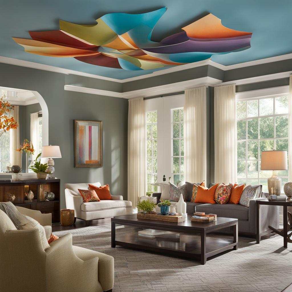
Benjamin Moore’s Stone Harbor, Sherwin-Williams’ Gateway Gray, and Benjamin Moore’s Silvery Blue are popular choices for ceiling paint colors that can transform the look and feel of a room. These colors can be paired with neutral walls or contrasting accents to create a unique and transformative interior design. Whether you’re looking to create a serene oasis or make a bold statement, incorporating color on ceilings is a sure way to add personality and style to your space.
Interior Design Tips for Colorful Ceilings
- Consider the overall color scheme and design style of the room when choosing a ceiling color. Soft shades of blue work well in a variety of interior styles, from modern to traditional.
- Take into account the natural lighting in the room. Different colors can reflect light in different ways, so it’s important to experiment with sample swatches and see how the color looks in the space throughout the day.
- Coordinate the ceiling color with the walls and other elements in the room for a cohesive and harmonious design. Consider using complementary or contrasting colors to create visual interest and depth.
By embracing the trend of incorporating color on ceilings, you can elevate your interior design and create a space that is unique, stylish, and visually engaging. So why not look up? The ceiling is the canvas that completes the overall design, and adding color to it can truly transform a room.
Tips for Choosing the Right Ceiling Color
When it comes to choosing the right ceiling color for your space, there are several factors to consider. The color scheme and design style of the room should be taken into account to ensure a cohesive and harmonious look. Additionally, the natural lighting in the room can play a role in how different colors appear throughout the day. To help you make the best decision, here are some tips for choosing the right ceiling color.
Consider the Overall Color Scheme and Design Style
Before selecting a ceiling color, think about the overall color scheme and design style of the room. Soft shades of blue can create a calming atmosphere, while bold colors like greens and reds can bring energy and vibrancy. If you prefer a more neutral look, warm neutrals and cozy browns can provide a comforting feel. By considering the existing colors and design elements in the space, you can choose a ceiling color that complements the overall aesthetic.
Take Lighting into Account
The natural lighting in the room can significantly impact how a ceiling color appears. Bright, sunny rooms may benefit from lighter colors that reflect light and create an airy feel. In contrast, rooms with limited natural light may benefit from warmer, darker colors that add depth and richness. Consider how different colors interact with the lighting throughout the day to ensure the chosen ceiling color looks its best in all lighting conditions.
Sample Swatches and Color Coordination
Once you have narrowed down your options, it’s essential to test out a few sample swatches in the space. Apply small sections of paint to the ceiling and observe how the colors look in different lighting conditions. This will give you a better idea of how the color will appear on a larger scale. Additionally, consider how the ceiling color coordinates with the walls and other elements in the room. Aim for a cohesive and harmonious color palette to create a visually pleasing and well-designed space.
Choosing the right ceiling color can make a significant impact on the overall look and feel of a room. By considering the color scheme, lighting, and coordination with other elements, you can select a ceiling color that enhances the space and creates a harmonious design. Take your time, test out sample swatches, and trust your instincts to find the perfect ceiling color for your home.
Conclusion
As we’ve explored the top color trends for ceilings in 2024, it’s clear that there are a multitude of options to consider when adding color to your space. From earthy tones and coastal-inspired blues to warm neutrals and moody hues, the possibilities are endless.
Benjamin Moore’s Blue Nova, C2’s Thermal, Dunn-Edwards’ Skipping Stones, Sherwin-Williams’ Upward, and Minwax’s Bay Blue are just a few of the best paint colors for ceilings that can transform your room into a stylish and inviting space.
Whether you’re looking to create a tranquil oasis with serene greens, add drama and sophistication with moody blues, or bring warmth and coziness with soothing browns, these color trends offer a range of choices for every design style and preference.
So, when planning your next interior design project, don’t forget to consider the impact that a beautifully painted ceiling can have. By incorporating these top color trends, you’ll be able to elevate your space and create a unique and stylish atmosphere that reflects your personal taste and enhances your overall design.
FAQ
What are the best color options for ceilings?
Some of the top color options for ceilings include soft shades of blue, versatile greys, crisp blacks, and delicate blues.
How do I choose the right ceiling color?
When choosing a ceiling color, consider the overall color scheme and design style of the room. Also, take into account the natural lighting and coordinate the ceiling color with the walls and other elements in the space.
What are some popular ceiling paint colors for 2024?
Some popular ceiling paint colors for 2024 include Benjamin Moore’s Stone Harbor, Sherwin-Williams’ Gateway Gray, and Benjamin Moore’s Silvery Blue.
How can I incorporate earthy tones for a natural vibe?
To incorporate earthy tones for a natural vibe, consider using colors like Benjamin Moore’s Blue Nova and C2’s Thermal, which offer grounded blue and mid-tone options.
What are some coastal-inspired blues for a relaxing retreat?
For a relaxing retreat, consider Benjamin Moore’s Blue Nova, C2’s Thermal, and Dunn-Edwards’ Skipping Stones, which offer deep and breezy blues.
How can I create a comforting feel with warm neutrals and cozy browns?
To create a comforting feel, consider using colors like Glidden’s Limitless for warm neutrals and Little Greene’s Ganache and Chocolate Color for cozy browns.
What are some versatile greys for a timeless elegance?
Some versatile greys for a timeless elegance include Little Greene’s Ganache, Chocolate Color, and Sherwin-Williams’ Sealskin.
How can I add drama and sophistication with moody blues?
To add drama and sophistication, consider colors like Benjamin Moore’s Blue Nova, C2’s Thermal, and Sherwin-Williams’ Stardew, which offer deep and dreamy blues.
What are some serene greens for a tranquil oasis?
For a tranquil oasis, consider Benjamin Moore’s Blue Nova, C2’s Thermal, and Sherwin-Williams’ Upward, which offer calming shades of green.
How can I create a warm and uplifting ambiance with bold reds?
To create a warm and uplifting ambiance, consider Sherwin-Williams’ Fireweed, which offers a rust and brown-toned red.
How can I achieve modern sophistication with crisp blacks?
To achieve modern sophistication, consider Behr’s Cracked Pepper, which offers a soft black shade.
What are some delicate blues for a fresh and calming feel?
For a fresh and calming feel, consider Benjamin Moore’s Crystalline and Sherwin-Williams’ Stardew, which offer soft shades of blue.
How can I create comfort and indulgence with soothing browns?
To create comfort and indulgence, consider Little Greene’s Ganache and Chocolate Color, which offer rich and soothing shades of brown.
How can I incorporate color on ceilings to embrace the trends?
To embrace the trends and incorporate color on ceilings, consider using popular choices like soft shades of blue to create a fresh and open sky effect.
What tips should I keep in mind when choosing a ceiling color?
When choosing a ceiling color, consider the overall color scheme, design style, natural lighting, and coordinate the color with walls and other elements for a cohesive design.
What are the best paint colors for ceilings in 2024?
Some of the best paint colors for ceilings in 2024 include Benjamin Moore’s Blue Nova, C2’s Thermal, and Dunn-Edwards’ Skipping Stones.