I’m excited to share with you some of the best Benjamin Moore cream colors that can add warmth and sophistication to your home. Cream paint colors are incredibly versatile and can be used in various rooms and applications, making them a popular choice for homeowners. Whether you’re looking to create a cozy living room, a serene bedroom, or a stylish kitchen, these cream colors from Benjamin Moore will inspire you with their beauty and versatility.
When it comes to creating a cream color palette for your home, Benjamin Moore offers a wide range of options to choose from. From warm and inviting shades to cool and refreshing tones, there’s a cream color that will suit your personal style and complement your existing decor.
Key Takeaways:
- Benjamin Moore cream colors can add warmth and sophistication to your home.
- Cream paint colors are versatile and can be used in various rooms and applications.
- There are a wide range of cream color options available from Benjamin Moore.
- Choose a cream color that complements your existing decor and personal style.
- Experiment with different cream shades to transform your space.
White Down by Benjamin Moore
When it comes to choosing the best Benjamin Moore cream colors, White Down is a top contender. This cream color is perfect for creating a warm and inviting atmosphere in your living room or primary bedroom. With its subtle warm undertones, White Down adds a touch of elegance and sophistication to any space. Whether you’re going for a traditional or modern look, this cream color complements a variety of color palettes.
White Down pairs beautifully with both cool and warm tones, making it a versatile choice for any style. You can easily incorporate it into your existing decor scheme or use it as a base color to build upon. The soft and cozy feel of White Down creates a serene and comfortable ambiance that will make you feel right at home.
“White Down by Benjamin Moore adds warmth and elegance to any room. Its warm undertones create a cozy and inviting atmosphere, making it a popular choice for living rooms and primary bedrooms.”
With White Down as your cream color of choice, you can expect a timeless and classic look that will never go out of style. Its neutral nature allows you to experiment with different accent colors and decor styles, making it easy to refresh your space whenever you desire. Whether you prefer a traditional, modern, or eclectic aesthetic, White Down will provide the perfect backdrop for your personal style.
So, if you’re looking to add warmth and sophistication to your home, consider White Down by Benjamin Moore as one of the best cream colors to choose from. Its versatility and timeless appeal make it a popular choice among homeowners and designers alike. Take the leap and transform your space with the elegance and cozy ambiance that White Down can bring.
Pointing by Farrow & Ball
Pointing by Farrow & Ball is a versatile cream color that can transform any space into an elegant and inviting haven. With its warm undertones and predominantly white appearance, Pointing is a popular choice for walls, cabinets, and trim. This cream color seamlessly blends with a variety of decor styles, making it a versatile option for any room in your home.
Whether you’re looking to create a cozy bedroom retreat or a sophisticated living area, Pointing by Farrow & Ball delivers a timeless and classic aesthetic. Its neutral yet warm tone provides a sense of calm and serenity, while still adding depth and character to your space. This cream color can be paired with vibrant accents or muted hues, allowing you to create a personalized and harmonious color palette.
“Pointing by Farrow & Ball adds a touch of sophistication and elegance to any room. Its warm undertones create a cozy and inviting atmosphere, while its predominantly white appearance ensures versatility in design. This cream color truly embodies the perfect balance between timeless elegance and modern style.”
Benefits of Pointing by Farrow & Ball
- Works well in any space, from bedrooms to living rooms
- Warm undertones provide a cozy and inviting atmosphere
- Can be used for walls, cabinets, and trim
- Pairs nicely with a variety of decor styles
- Creates a timeless and classic aesthetic
Transform your home with the versatility and elegance of Pointing by Farrow & Ball. Whether you’re looking to refresh your living room or revamp your kitchen, this cream color will bring depth, warmth, and sophistication to your space.
Maritime White by Benjamin Moore
Maritime White by Benjamin Moore is a sophisticated cream color that exudes warmth and elegance. With its subtle undertones, this cream shade adds depth and dimension to any room, creating a cozy and inviting atmosphere.
This versatile cream color can be used in various applications, from walls to furniture and trim. It pairs beautifully with a wide range of colors, allowing you to create a harmonious and cohesive look in your space. Whether you prefer a traditional or modern aesthetic, Maritime White can seamlessly blend in and enhance your overall design.
“Maritime White by Benjamin Moore is the perfect choice for those seeking a warmer alternative to traditional white paint. Its soft and inviting nature creates a soothing ambiance that instantly makes any room feel more welcoming.” – Interior Designer
When used in well-lit areas, Maritime White reflects light beautifully, adding a luminous glow to your space. This cream color is particularly stunning in natural light, creating a soft and serene environment that promotes relaxation and comfort.
| Pros | Cons |
|---|---|
| Creates a warm and inviting atmosphere | May not work well in poorly-lit spaces |
| Pairs well with a variety of colors | Requires proper lighting to showcase its true beauty |
| Versatile and suitable for different design styles | May show dirt and marks more easily compared to darker colors |
Overall, Maritime White by Benjamin Moore is an excellent choice for those who want to add a touch of sophistication and warmth to their living spaces. Its versatility, elegance, and ability to create a serene ambiance make it one of the best Benjamin Moore cream colors available.
Where to Use Maritime White
Maritime White is particularly well-suited for living rooms, bedrooms, and dining areas. Its understated elegance makes it a popular choice for both traditional and contemporary design styles. Consider using Maritime White for:
- Walls and ceilings
- Trim and molding
- Cabinets and furniture
- Doors and window frames
Experiment with incorporating Maritime White into your existing color scheme or use it as a neutral base to build upon. Whether you decide to go all out or use it as an accent, Maritime White is sure to elevate the overall look and feel of your space.
Best Benjamin Moore Cream Colors: Section 5 – Sand by Farrow & Ball
Sand by Farrow & Ball is a cream color with cool undertones that adds a touch of sophistication to any space. This versatile cream color works well with a variety of accent colors, including black, navy, chrome, and marble. Its warm undertones create a cozy and inviting glow, especially in natural light.
Whether you’re looking to paint the walls, cabinets, or trim, Sand by Farrow & Ball is a great choice. Its predominantly white appearance makes it easy to pair with different decor styles, creating a harmonious and elegant atmosphere. This cream color is particularly stunning when used in rooms with ample natural light, as it enhances the warm and inviting ambiance.
Consider using Sand by Farrow & Ball in your living room, bedroom, or even your kitchen. Its cool undertones provide a refreshing contrast to warmer elements in the room, creating a visually balanced and visually engaging environment. With Sand, you can achieve a timeless and sophisticated look that will never go out of style.
Summary:
- Sand by Farrow & Ball is a cream color with cool undertones.
- It pairs well with black, navy, chrome, and marble accents.
- This cream color creates a cozy and inviting glow, especially in natural light.
- It can be used for walls, cabinets, and trim, and complements various decor styles.
White Dove by Benjamin Moore
When it comes to choosing the best Benjamin Moore cream colors, White Dove is a popular choice that deserves attention. This cream color adds a touch of warmth and elegance to any space, making it a versatile option for various applications. Whether you’re looking to refresh your living room, bedroom, or kitchen, White Dove can create a serene and inviting atmosphere.
What makes White Dove so appealing is its soft and understated feel. It complements any color palette, allowing other elements in the room to shine. This cream color works particularly well when paired with a white base, adding depth and dimension without overpowering the space. Whether you prefer a modern or traditional aesthetic, White Dove can effortlessly blend in and enhance the overall design.
“White Dove by Benjamin Moore is a popular choice for adding warmth to a white base.”
One of the advantages of using White Dove is its versatility. It can be applied on walls, trim, and cabinets, giving you the freedom to create a cohesive look throughout your home. Whether you’re going for a monochromatic scheme or incorporating contrasting colors, White Dove will seamlessly blend in. Its subtle cream undertones create a harmonious backdrop for any style or decor.
So if you’re searching for a cream color that adds warmth and versatility to your space, look no further than White Dove by Benjamin Moore. Its soft and understated charm will transform your home into a cozy haven.
Table
| Cream Color | Undertones | Suitable Rooms |
|---|---|---|
| White Dove | Soft cream undertones | Living rooms, bedrooms, kitchens |
Soft Chamois by Benjamin Moore
Soft Chamois by Benjamin Moore is a versatile cream color that reflects the surrounding light, creating a warm and inviting ambiance in any room. Its soft and understated hue is perfect for those who want to add a touch of warmth without overwhelming the space. This cream color can take on subtle undertones, depending on the lighting and adjacent colors, making it adaptable to various design schemes.
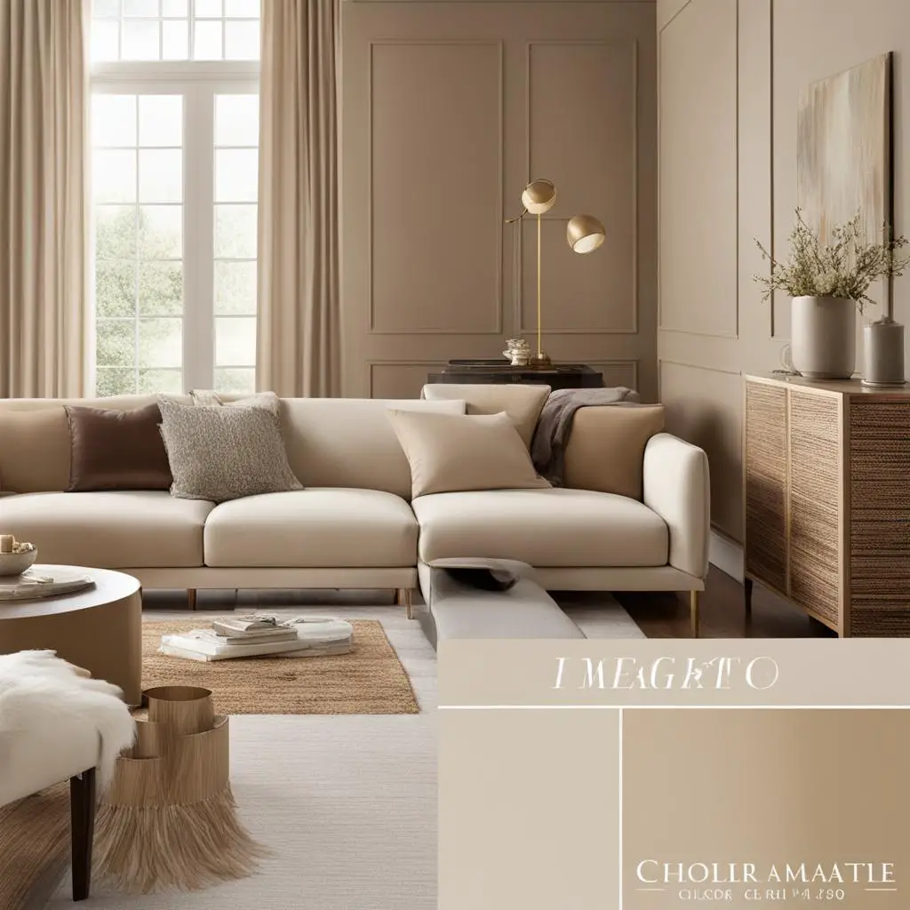
One of the standout features of Soft Chamois is its ability to transform with the changing light. In natural light, it exudes a soothing and relaxing glow, while in artificial light, it can appear slightly warmer or cooler, adapting to the surrounding elements. This versatility allows homeowners to create different moods and atmospheres within their spaces.
Soft Chamois works well as a neutral backdrop, complementing a wide range of color palettes and decor styles. Whether paired with bold accents or subtle finishes, this cream color adds a touch of elegance and sophistication to any room. It can be used on walls, trim, or even as a cabinet color, seamlessly blending with other design elements.
Soft Chamois: A Versatile Cream Color
When considering Soft Chamois for your space, keep in mind its reflective properties and how it interacts with lighting. Test samples in different areas of the room to see how the color shifts throughout the day. Additionally, consider the other colors and materials in the space to ensure a cohesive and harmonious look.
| Pros | Cons |
|---|---|
| Reflects surrounding light, creating a warm and inviting atmosphere | Color may appear slightly different in different lighting conditions |
| Versatile and adaptable to various design schemes | May not provide enough contrast with very light or very dark elements |
| Complements a wide range of color palettes and decor styles | Requires consideration of surrounding colors and materials for a cohesive look |
Overall, Soft Chamois by Benjamin Moore is a versatile cream color that adds warmth and sophistication to any space. Its ability to reflect light and adapt to different surroundings makes it an excellent choice for homeowners looking to create a cozy and inviting atmosphere. Whether used on walls, trim, or cabinets, Soft Chamois enhances the overall aesthetic and complements a variety of design styles.
Linen White by Benjamin Moore
Linen White by Benjamin Moore is a highly versatile cream color that offers a warm and inviting ambiance to any space. With its warm undertones, this cream color creates a sense of coziness and tranquility, making it perfect for bedrooms, living rooms, or any area where you want to promote relaxation. Its neutral nature allows other design elements to shine, making it a great choice for those who want to create a harmonious and cohesive look.
This cream color is an excellent choice if you’re looking for a paint shade that can easily adapt to different color palettes and decor styles. Whether you prefer a more traditional or modern aesthetic, Linen White seamlessly blends with various design elements, allowing you to experiment and create a space that reflects your personal style and taste.
Table: Comparing Cream Colors
| Cream Color | Undertones | Best Application |
|---|---|---|
| Linen White by Benjamin Moore | Warm | Bedrooms, living rooms, any space that requires a cozy and tranquil atmosphere |
| White Down by Benjamin Moore | Warm | Living rooms, primary bedrooms |
| Pointing by Farrow & Ball | Warm | Walls, cabinets, and trim |
| Maritime White by Benjamin Moore | Warm | Adding depth and elegance to any room |
| Sand by Farrow & Ball | Cool | Pairing with black, navy, chrome, and marble accents |
When using Linen White, consider the lighting conditions in your space as it can subtly change the appearance of the color. Natural light enhances the warm undertones, creating a soft and inviting glow, while artificial light can give it a slightly different character. Take the time to test the color in different lighting situations to ensure it achieves the desired effect.
In conclusion, Linen White by Benjamin Moore is a fantastic cream color option that brings warmth and versatility to any room. Its neutral nature allows it to complement a wide range of design choices, while its warm undertones create a cozy and inviting atmosphere. With Linen White, you can easily achieve a harmonious and tranquil space that reflects your personal style and creates a retreat from the hustle and bustle of everyday life.
Best Benjamin Moore Cream Colors: Section 9 – School House White by Farrow & Ball
In our exploration of the best Benjamin Moore cream colors, we come across School House White by Farrow & Ball. This beautiful creamy white shade adds a warm and soft glow to any room. With its versatility and timeless appeal, it has become a popular choice among homeowners and designers alike.
School House White pairs exceptionally well with industrial elements such as concrete floors, creating a captivating contrast that adds character to your space. Whether you’re looking to enhance the charm of a vintage-inspired room or add a touch of elegance to a modern space, this cream color delivers.
One of the best features of School House White is its ability to reflect light, creating a luminous and inviting atmosphere. It complements a wide range of decor styles, from traditional to contemporary, and works harmoniously with other colors in your palette.
“School House White by Farrow & Ball is a beautiful creamy white that creates a warm and soft glow in any room.”
When using School House White, consider incorporating elements that highlight its creamy undertones. Pair it with natural textures, such as wooden furniture or woven accents, to create a cozy and inviting space. This cream color also works well with metallic accents, adding a touch of sophistication and elegance.
Overall, School House White is a versatile cream color that can transform any room into a welcoming and stylish haven. Its ability to create a warm and soft ambiance, along with its compatibility with various design styles, makes it a top choice for those seeking a timeless and elegant look.
| Cream Color | Brand | Description |
|---|---|---|
| School House White | Farrow & Ball | A beautiful creamy white that creates a warm and soft glow in any room. Pairs well with industrial elements and complements a wide range of decor styles. |
| White Down | Benjamin Moore | A popular choice for living rooms and primary bedrooms. Adds warmth and elegance to any space. |
| Pointing | Farrow & Ball | A versatile cream color with warm undertones that works well in any space. Can be used for walls, cabinets, and trim. |
| Maritime White | Benjamin Moore | A sophisticated cream color that adds depth and elegance to any room. Perfect for those seeking a warmer alternative to traditional white paint. |
Irish Linen Limewash by Sydney Harbour Paints
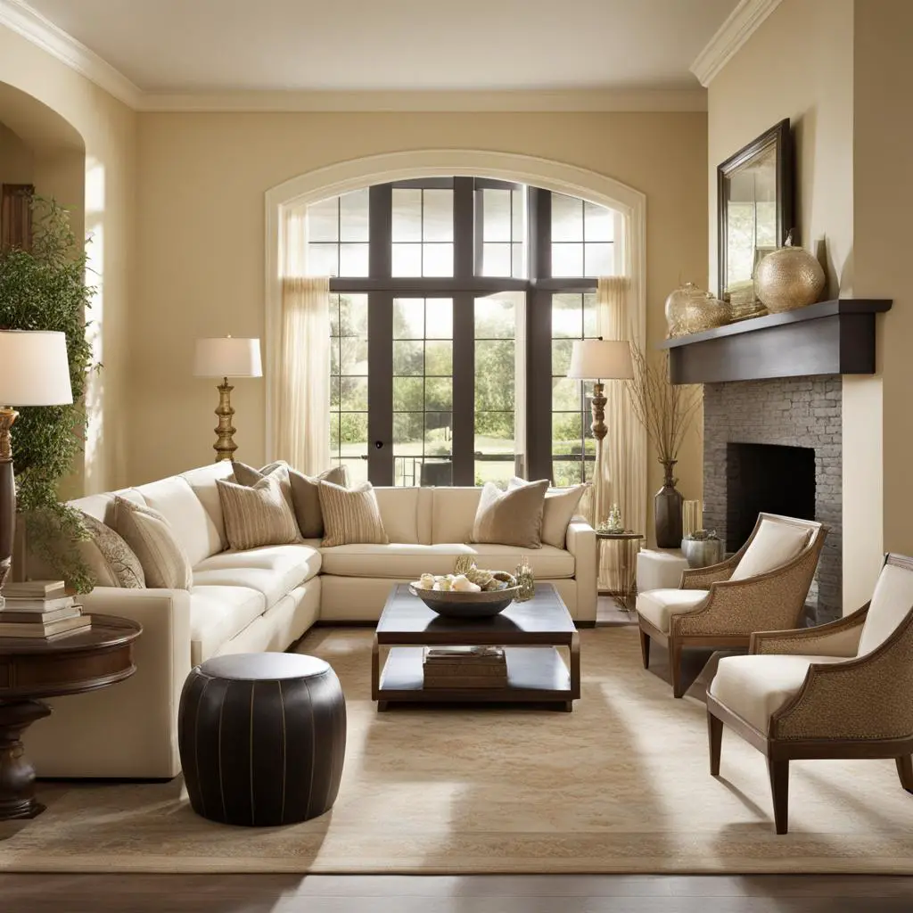
One cream color that stands out for its unique texture and depth is Irish Linen Limewash by Sydney Harbour Paints. Its warm white hue adds a touch of elegance and sophistication to any space. The texture of the paint creates visual interest, adding depth and character to your walls.
Irish Linen Limewash requires a few steps to achieve the perfect finish, but the result is worth the effort. The application process involves using a brush or a hand-finished trowel technique to create a beautiful mottled effect. This technique gives your walls a soft, weathered appearance that is both timeless and visually striking.
With Sydney Harbour Paints’ Irish Linen Limewash, you can transform any room into a cozy, inviting retreat. The warm white color adds a sense of warmth and comfort, making it perfect for bedrooms, living rooms, and even dining areas. Its versatility allows it to be paired with a variety of decor styles, from traditional to contemporary.
| Benefits of Irish Linen Limewash by Sydney Harbour Paints | Usage |
|---|---|
| Unique texture and depth | Interior walls |
| Warm white hue | Bedrooms |
| Creates a cozy and inviting atmosphere | Living rooms |
| Versatile and complements various decor styles | Dining areas |
Irish Linen Limewash by Sydney Harbour Paints adds a touch of sophistication and character to any room. Its unique texture and warm white hue create a cozy and inviting atmosphere. Transform your space into a retreat with this versatile cream color.
Experience the beauty of Irish Linen Limewash by Sydney Harbour Paints and elevate the ambiance of your home. Its timeless appeal and mottled effect make it a standout choice for those seeking a cream color with a touch of luxury.
Best Benjamin Moore Cream Colors: Pale Oak Cream Color
When it comes to choosing the best Benjamin Moore cream colors, Pale Oak is a standout option. This warm cream color offers a unique blend of versatility and sophistication, making it a popular choice for a wide range of home styles. Whether you’re looking to create a cozy living room or an elegant bedroom, Pale Oak can help you achieve the desired ambiance.
Pale Oak’s warm undertones add a touch of depth to any space, while still maintaining a sense of brightness. It pairs beautifully with both warm and cool fabrics or accents, allowing you to experiment with different color palettes. Whether you prefer earthy tones or cooler shades, Pale Oak effortlessly complements them all.
To showcase the versatility of Pale Oak, here is a table comparing this cream color to other popular Benjamin Moore options:
| Cream Color | Undertones | Best Applications |
|---|---|---|
| Pale Oak | Warm | Living rooms, bedrooms, common areas |
| White Down | Warm | Living rooms, primary bedrooms |
| Pointing | Warm | Walls, cabinets, trim |
| Maritime White | Warm | Any room for added depth |
As you can see, Pale Oak stands out with its warm undertones and versatile applications. Whether you’re going for a cozy or sophisticated look, this cream color delivers outstanding results.

Choosing Pale Oak for Your Home
When incorporating Pale Oak into your home, consider the existing color palette and lighting conditions. This cream color works well with natural light, creating a soothing and inviting atmosphere. It pairs beautifully with both light and dark furniture, allowing you to easily mix and match styles.
Whether you’re painting the walls, trim, or cabinets, Pale Oak can transform any space into a warm and welcoming haven. Its elegant yet understated feel adds a touch of sophistication to any room, making it a timeless choice for your home.
Cloud White by Benjamin Moore
Cloud White by Benjamin Moore is a versatile cream color that adds a touch of warmth and elegance to any space. This neutral cream color has a subtle undertone that coordinates well with both warm and cool colors, making it a popular choice for interior design projects. Whether you’re painting walls, cabinets, or trim, Cloud White complements a variety of color palettes and decor styles.
One of the advantages of Cloud White is its ability to adapt to different lighting conditions. This cream color looks great in natural light, creating a soft and inviting glow. It also holds up well under artificial lighting, maintaining its warm and neutral appearance. Whether your space receives abundant sunlight or relies on artificial lighting, Cloud White by Benjamin Moore will enhance its overall atmosphere.
Why Choose Cloud White?
- Neutral cream color with warmth
- Coordinates well with both warm and cool colors
- Adapts to different lighting conditions
- Complements a variety of color palettes and decor styles
Cloud White is a timeless and versatile cream color that can transform any room. Whether you’re looking to create a cozy and inviting living area or a sophisticated and elegant bedroom, Cloud White by Benjamin Moore is a top choice. Its adaptability, warm undertone, and compatibility with various design elements make it a go-to option for homeowners and interior designers alike.
| Cream Color | Main Features |
|---|---|
| White Down by Benjamin Moore | Warm undertones, adds elegance |
| Pointing by Farrow & Ball | Versatile, works well in any space |
| Maritime White by Benjamin Moore | Sophisticated, warm, and inviting |
| Sand by Farrow & Ball | Cool undertones, pairs well with black, navy, chrome, and marble |
| White Dove by Benjamin Moore | Soft and understated, versatile |
| Soft Chamois by Benjamin Moore | Reflects surrounding light, creates a soothing atmosphere |
| Linen White by Benjamin Moore | Quiet and neutral, allows other elements to shine |
| School House White by Farrow & Ball | Beautiful creamy white, adds character |
| Irish Linen Limewash by Sydney Harbour Paints | Unique texture and depth, adds warmth and visual interest |
| Pale Oak by Benjamin Moore | Warm cream color without feeling too yellow |
| Cloud White by Benjamin Moore | Neutral cream color with warmth, versatile |
| Calm by Benjamin Moore | Soft warm white with lavender undertones, creates a serene atmosphere |
| Chantilly Lace by Benjamin Moore | Crisp white with a slight cream undertone, versatile backdrop |
| Alabaster by Sherwin-Williams | Warm shade with taupe undertones, adds depth to walls and millwork |
Calming Cream: Benjamin Moore’s Calm Cream Color
When it comes to creating a serene and soothing atmosphere in your home, Benjamin Moore’s Calm cream color is a perfect choice. With its soft warm white undertones and gentle lavender hues, this shade adds a touch of tranquility to any space. Whether you’re looking to create a peaceful bedroom or a relaxing living room, Calm brings a sense of serenity and balance to your surroundings.
One of the key benefits of Calm by Benjamin Moore is its versatility. This cream color works harmoniously with both cooler and warmer tones, allowing you to create a cohesive and inviting environment. Pair it with cooler blues or greens for a refreshing vibe, or combine it with warmer earth tones for a cozy and comforting feel.
To truly appreciate the beauty of Calm, consider its ability to reflect and play with natural and artificial light. Whether bathed in sunlight or softly illuminated by a warm lamp, this cream color tends to transform and adapt, creating a captivating and serene ambiance.
“Calm by Benjamin Moore brings a sense of tranquility and peace to my home. It’s the perfect cream color that complements both warm and cool elements in my decor. I love how it creates a soothing and inviting atmosphere in every room.” – Happy Homeowner
Embrace the calming power of cream with Benjamin Moore’s Calm color. Let it instill a sense of peace and relaxation in your home, allowing you to create a space where you can truly unwind and find solace.
Chantilly Lace by Benjamin Moore
Chantilly Lace by Benjamin Moore is a versatile cream color that adds a touch of elegance to any space. With its crisp white base and slight cream undertone, it provides a clean and fresh look that complements various color palettes and design styles. This cream color is perfect for those seeking a classic and timeless backdrop that allows other elements in the room to shine.
Whether used on walls, trim, or cabinetry, Chantilly Lace creates a seamless and cohesive look. Its neutral undertones make it an excellent choice for both matte and satin finishes, adding depth and dimension to the overall design. This cream color is particularly suitable for modern and minimalist interiors, as its clean and bright appearance creates an open and airy atmosphere.
Chantilly Lace pairs beautifully with other neutral shades, such as soft grays or warm taupes, for a monochromatic color scheme. The contrast between this cream color and darker accents, such as black or navy, creates a striking visual impact. Additionally, Chantilly Lace complements natural materials like wood, stone, and marble, enhancing their inherent beauty.
| Pros | Cons |
|---|---|
| – Classic and elegant | – May appear too stark in rooms with limited natural light |
| – Versatile for different design styles | – Requires proper lighting to avoid a sterile look |
| – Creates a bright and airy atmosphere | – May not suit every color palette |
Chantilly Lace by Benjamin Moore is a timeless cream color with a clean and fresh aesthetic. Its versatility and ability to enhance various design styles make it a popular choice among homeowners and interior designers alike. Whether you’re looking to create a modern or traditional space, this cream color is sure to add a touch of elegance to your home.
Best Benjamin Moore Cream Colors: Top Picks and Ideas (2024)
When it comes to choosing the perfect cream color for your home, Benjamin Moore offers a range of stunning options. One standout shade is Alabaster by Sherwin-Williams. This warm cream color has taupe undertones that add a velvety depth to walls and millwork. It creates a modern yet cozy atmosphere and pairs effortlessly with crisp white trim and medium wood tones.
Alabaster by Sherwin-Williams is a versatile cream color that can work well in a variety of spaces. Whether you’re looking to create a serene bedroom retreat or a welcoming living room, this shade offers the perfect balance of warmth and sophistication. Its taupe undertones add an element of richness, making it a great choice for those who want to add depth and visual interest to their walls.
One of the best features of Alabaster is its ability to coordinate with a wide range of colors and textures. Whether you prefer a minimalist aesthetic or a more eclectic look, this cream color can complement your chosen decor style. It’s a neutral shade that allows other elements in the room to shine, whether it’s artwork, upholstery, or architectural details.
If you’re looking to transform your space with a beautiful cream color, consider Alabaster by Sherwin-Williams. Its warm undertones, velvety depth, and ability to coordinate with various design elements make it a top choice for any home. Whether you use it on walls, millwork, or both, this cream color is sure to add a touch of elegance and sophistication to your space.
Table: Comparison of Benjamin Moore Cream Colors
| Cream Color | Undertones | Best Application |
|---|---|---|
| White Down by Benjamin Moore | Warm | Living rooms, primary bedrooms |
| Pointing by Farrow & Ball | Warm | Walls, cabinets, trim |
| Maritime White by Benjamin Moore | Warm | Any room |
| Sand by Farrow & Ball | Cool | Pair with black, navy, chrome, marble accents |
| White Dove by Benjamin Moore | Neutral | Various applications |
| Soft Chamois by Benjamin Moore | Reflects surrounding light | Any room |
| Linen White by Benjamin Moore | Warm | Creating a cohesive look |
| School House White by Farrow & Ball | Warm | Add character to space |
| Irish Linen Limewash by Sydney Harbour Paints | Warm | Adding warmth and visual interest |
| Pale Oak by Benjamin Moore | Warm | Versatile choice |
| Cloud White by Benjamin Moore | Neutral | Works with different color palettes |
| Calm by Benjamin Moore | Soft warm white with lavender undertones | Creating a serene atmosphere |
| Chantilly Lace by Benjamin Moore | Criss white with slight cream undertone | Versatile backdrop for finishes |
| H2: Alabaster by Sherwin-Williams | Taupe undertones | Adding depth and warmth to walls and millwork |
Conclusion
In conclusion, Benjamin Moore offers a diverse selection of the best cream colors on the market. These colors can bring warmth, elegance, and versatility to any home. Whether you prefer a cream color with warm undertones, cool undertones, or a hybrid shade, Benjamin Moore has got you covered.
By experimenting with different cream shades, you can transform the look and feel of your space. Benjamin Moore’s cream colors are perfect for creating a cozy and inviting atmosphere in your living room, bedroom, kitchen, or any other room. The wide range of options ensures that you will find the perfect cream color to suit your style and preference.
So, if you’re looking to add a touch of sophistication and charm to your home, consider incorporating Benjamin Moore’s cream colors into your design. With their quality and versatility, these cream colors are a top choice for homeowners and interior designers alike. Discover the beauty of Benjamin Moore’s cream colors and elevate the aesthetic of your space.
FAQ
What are the best Benjamin Moore cream colors?
Some of the best Benjamin Moore cream colors include White Down, Pointing, Maritime White, Sand, White Dove, Soft Chamois, Linen White, School House White, Irish Linen Limewash, Pale Oak, Cloud White, Calm, Chantilly Lace, and Alabaster.
What rooms are these cream colors suitable for?
These cream colors are versatile and can be used in various rooms, including living rooms, bedrooms, kitchens, and bathrooms.
Do these cream colors complement different color palettes?
Yes, these cream colors can complement a variety of color palettes, allowing you to create a cohesive and harmonious look.
Can these cream colors be used for both walls and trim?
Yes, many of these cream colors can be used for both walls and trim, providing flexibility in design.
Do these cream colors work well with different decor styles?
Yes, these cream colors can work well with different decor styles, whether you prefer a traditional, modern, or eclectic look.
Are these cream colors easy to coordinate with other elements in the room?
Absolutely! These cream colors are versatile and can coordinate well with various fabrics, accents, and finishes.
Can these cream colors create a warm and inviting atmosphere?
Yes, many of these cream colors have warm undertones that can create a cozy and inviting atmosphere in your home.
Are these cream colors suitable for both natural and artificial light?
Yes, these cream colors look great in various lighting conditions, whether it’s natural light or artificial light. They can adapt to different lighting and still maintain their beauty.
How do I choose the right cream color for my space?
To choose the right cream color, consider the overall color palette, lighting conditions, and the mood you want to create in the space. It can also be helpful to test samples on the wall to see how they look in your specific environment.
Can these cream colors add depth and elegance to a room?
Yes, many of these cream colors, such as Maritime White and Irish Linen Limewash, can add depth and elegance to any room, elevating its overall aesthetic.

